This entry is part of the Chart Index, the reference library for the Chart Design Field Guide.
The bar chart is where most analytical work begins — and, too often, where it ends. It is the default output of every spreadsheet, the first chart a new analyst reaches for, and the visual form most business stakeholders can read without instruction. That ubiquity is both its strength and its risk: because bar charts are easy to make, they are easy to make badly.
This entry covers the vertical bar (column chart) and the horizontal bar. Same encoding, different orientation, meaningfully different use cases.
What it is
A bar chart maps a categorical variable to position on one axis and a quantitative variable to length on the other. Each bar represents one category; the length of the bar encodes the value. The eye compares lengths — which is something human perception does well, provided the bars share a common baseline.
That is the canonical form: a grouped bar comparing four regions across four time periods. The grouped layout works here because the reader's primary question is comparative — which region led each quarter? — rather than additive.
When to use it
Bar charts are the right choice when:
- You are comparing magnitudes across categories — revenue by region, headcount by department, defect counts by type.
- You have fewer than ~15 categories. Beyond that, the chart becomes a wall. Consider a table, a dot plot, or a small-multiple design instead.
- The categories are nominal (no inherent order) or ordinal (a natural order you want to preserve). For time series with many points, a line chart is almost always better.
- The reader's question is "which is bigger?" or "by how much?" — questions that length comparison answers directly.
- You want to show absolute values, not proportions. For part-to-whole relationships, a stacked bar or treemap may be more appropriate.
When not to use it
- Time series with more than 6–8 points. A bar chart makes each point discrete; a line chart shows the trend. Use a bar chart for time only when the discrete identity of each period matters (e.g. comparing fiscal years, not showing a daily trend).
- Too many categories. More than 12–15 bars and the chart loses legibility. Consider ranking and showing the top N, or switching to a horizontal layout.
- Showing proportions. A bar chart can show 34% and 28%, but it does not naturally convey that these are parts of a whole. Stacked bars or waffle charts make the part-to-whole relationship explicit.
- Comparing values that are very close together. Length comparison struggles when differences are small relative to the absolute values. A dot plot or slope chart will be more readable.
Design principles
The bar chart is well-studied. The principles below draw from Edward Tufte's data-ink ratio, Stephen Few's perceptual guidelines, and Alberto Cairo's emphasis on truthfulness and intent.
Start the axis at zero
This is non-negotiable for bar charts. The bar's length is the encoding — if the axis starts at 50 instead of 0, a bar representing 60 looks ten times as tall as a bar representing 55, when in fact the difference is less than 10%. Tufte calls this the lie factor: the ratio of the visual effect to the data effect.
Direct-label when possible
Legends force the reader's eye to shuttle between the data and a separate key. For fewer than five series, label the bars directly. Few calls this reducing the burden of visual lookup.
Minimise non-data ink
Gridlines should be the lightest element in the chart — they are reference scaffolding, not the message. Remove chart borders, reduce tick marks, and let the bars carry the weight. Tufte's principle: maximise the data-ink ratio.
Use horizontal bars for long labels
When category names are long (station names, product descriptions, department titles), a horizontal bar chart avoids the angled or truncated labels that make vertical bar charts unreadable. The eye reads left-to-right naturally — the label flows into the bar.
Highlight the item of interest
Few's principle: if one bar carries the story, give it a different shade. The rest recede into a neutral tone. The reader's eye goes straight to the highlighted bar without scanning. In the example above, the most expensive station is steel blue while the others are a quiet grey.
Label bars directly, not with a legend
Legends force the reader to shuttle between the data and a key. For single-series bars, place the value at the end of each bar. For multi-series, label the first bar of each series and let the reader infer the rest. The goal is to eliminate every unnecessary eye movement between the data and its meaning.
Show axes only when necessary
A vertical bar chart needs a value axis so the reader can estimate heights. A horizontal bar chart with direct value labels does not — the numbers are right there. Remove the axis and the gridlines. Every pixel of non-data ink is scaffolding the reader has to process before they reach the message.
Sort deliberately
If the categories have no inherent order, sort by value. This turns a bar chart into a ranked list and makes the message immediate. If the categories do have an order (months, age bands, severity levels), preserve it — the reader expects it.
Count the categories
Bar charts are generous, but not infinite. Three to ten categories usually read cleanly. Ten to twenty can work if the labels are short and the chart is given room. Beyond that, the reader is no longer comparing bars; they are searching a list. Switch to horizontal bars, show the top N, use a table, or choose a lighter form such as a lollipop or dot plot.
Choose grouping intentionally
Grouped bars are for comparison: which region is biggest this quarter? Stacked bars are for composition: what is the total, and what contributed to it? The choice is not aesthetic — it changes the question the chart answers.
Few warns that stacked bars make it hard to compare segments that don't share the bottom baseline. Only the bottom series is directly comparable; the rest float. If precise comparison between series matters, use grouped.
Visual practices
The best bar charts are not made by adding more decoration. They are made by choosing one analytical question, then removing anything that does not help answer it. The examples below are deliberately plain: the point is not to show every possible treatment, but to show patterns that are safe to publish.
Use one colour until colour has work to do
Colour is not a reward for having categories. If every bar is part of the same measure, a single colour is usually the cleanest choice. Use different colours only when they encode real meaning: a product family, a political party, a status, a benchmark band, or a specific item of interest.
Turn long labels into a ranked list
A vertical bar chart with long labels usually forces angled text, truncation, or both. A horizontal bar chart makes the category label part of the reading path: label, bar, value. When the categories are nominal, sort them. A sorted horizontal bar is not just a chart; it is a ranked argument.
Use a reference line before adding more colour
Benchmarks often add more meaning than another colour scale. A target, average, median, or industry benchmark gives the reader a second question: not only which is highest?, but which is high enough? Keep the line quiet. It should calibrate the bars, not compete with them.
Use 100% stacking only when the total is not the point
A regular stacked bar preserves the total. A 100% stacked bar discards it so the composition can be compared. That is sometimes exactly right: customer mix, channel share, survey response, portfolio allocation. But it is a trade-off. If the absolute totals matter, show them somewhere else or choose another form.
Use diverging bars for values around a meaningful zero
Diverging bars are useful when zero has semantic force: profit and loss, budget variance, population change, survey agreement, sentiment. The baseline becomes the centre of the chart. Colour can help here because it carries a sign: positive and negative are different states, not decorative categories.
Anatomy
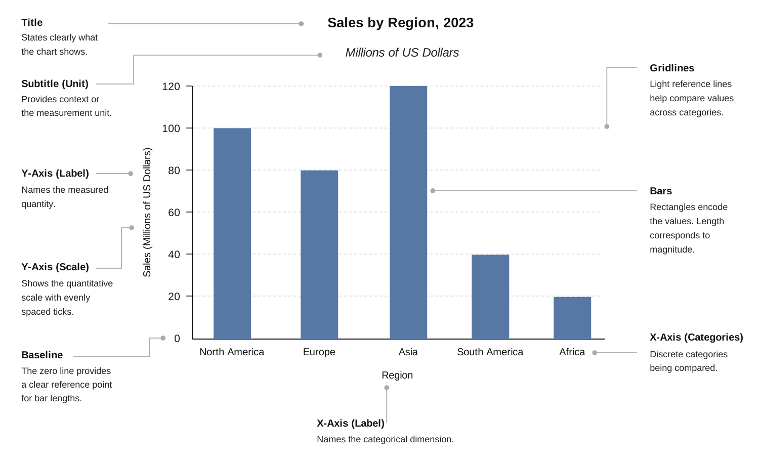
Every bar chart has the same structural elements: a zero baseline, a category axis, a value axis, the bars themselves, and optional gridlines. The key insight from Tufte: the bars are the chart. Everything else — gridlines, borders, tick marks — is scaffolding. Keep the scaffolding quiet.
Related types
- Lollipop chart — replaces bars with dots on sticks. Less ink, same encoding. Better when you have many categories and want to reduce visual weight.
- Dot plot — drops the stick entirely. Good for comparing values that are close together, where bar length differences would be invisible.
- Stacked bar — adds a part-to-whole dimension. Covered in a separate Chart Index entry.
- 100% stacked bar — normalises each total to 100%. Good for comparing mix; poor for comparing absolute volume.
- Diverging bar — uses a central zero baseline. Good for variance, change, or positive/negative values.
- Floating bar — starts and ends away from zero. Good for ranges, schedules, and intervals where the span matters more than the start value.
- Histogram — looks like a bar chart but encodes a continuous distribution, not categories. The bars are contiguous (no gaps) because the x-axis is continuous.
- Slope chart — for comparing two time points across categories. Often better than a grouped bar when you care about the direction of change more than absolute values.
Reading list
- Tufte, E. (2001). The Visual Display of Quantitative Information. On data-ink ratio and lie factor.
- Few, S. (2012). Show Me the Numbers. Chapter on bar chart best practices.
- Cairo, A. (2016). The Truthful Art. On choosing encodings that respect the data.
- Cleveland, W. & McGill, R. (1984). Graphical Perception. The foundational study showing position-along-a-scale is more accurate than angle or area.