Notes from a working studio.
Practical writing about data warehousing, BI design, AI in business operations, analytics engineering, and the consulting work that surrounds them.
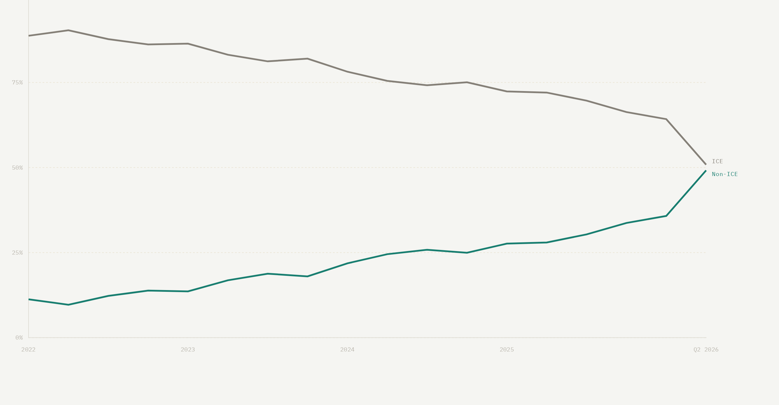

When Geography Distorts the Data: Why Cartograms Can Make Better Maps
How cartograms and hexagonal tilegrams give data the visual weight it deserves, and how Australia's Federal Election Explorer uses them to reveal representation, change and political consequence.
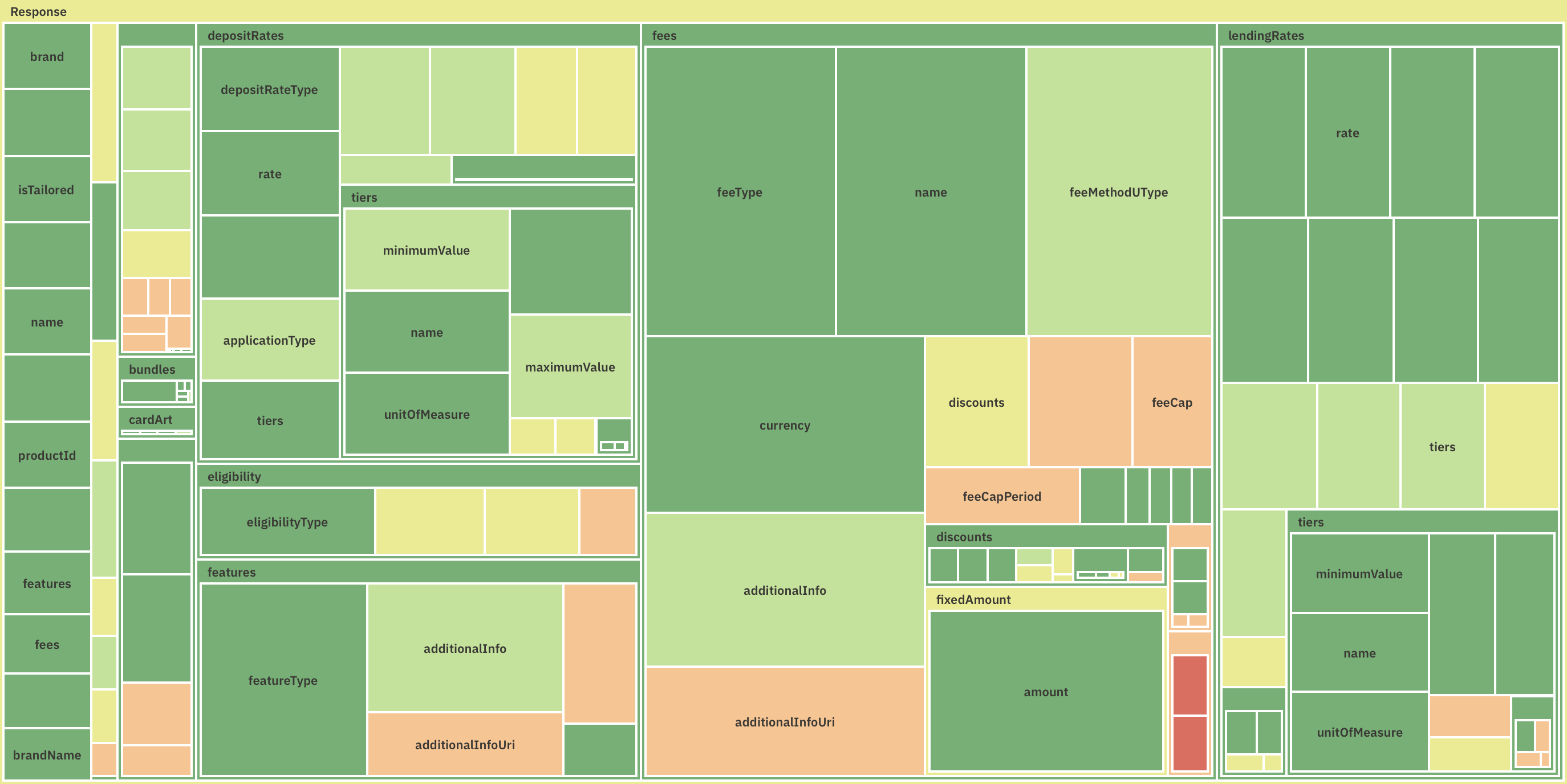
Making Australia's Consumer Data Right Visible
How Australia’s Consumer Data Right makes the banking market visible, and how the Product Ledger and Ecosystem Health dashboard turn open data into useful views of products and compliance.
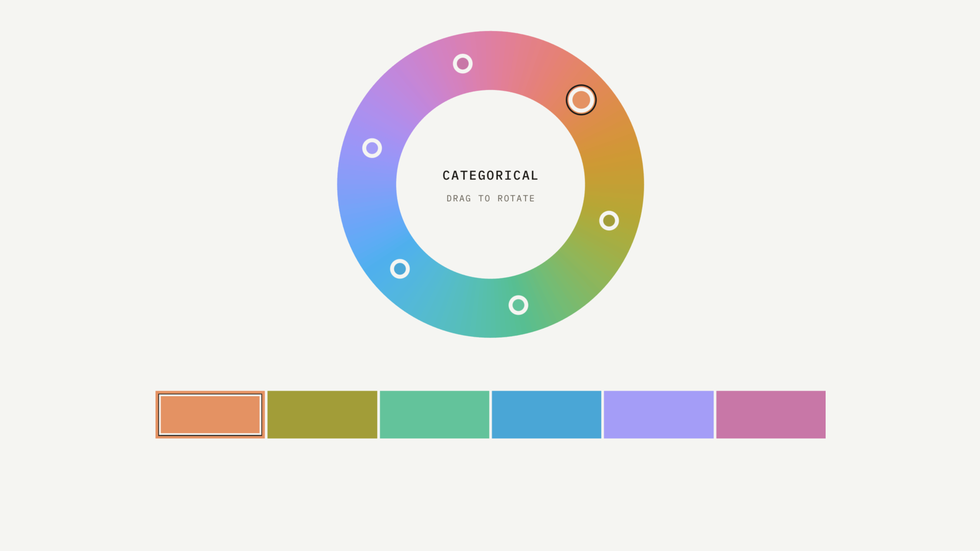
Colour That Communicates
Why Better Use Of Colour Leads to Better Decisions

Backing Every World Cup Favourite
A simple experiment to see how well betting markets predict the knockout stage, and whether blindly backing every favourite would actually have paid off.

The Price of a Nation
Every 2026 World Cup squad, drawn at the size of its players' combined club value. Forty-eight nations read as a balance sheet.

Stop reporting. Start designing decisions.
Most BI teams measure themselves by the number of reports they ship, but reports are not the deliverable - the decisions they enable are. Once you start designing for decisions instead of reports, nearly everything about the work changes.