The 2026 World Cup is the first with forty-eight teams, and the widest spread of money the tournament has ever staged. Reading the field as a balance sheet rather than a bracket, the gap between the richest and poorest squads is not a rounding error — it is three orders of magnitude.
Where the money is
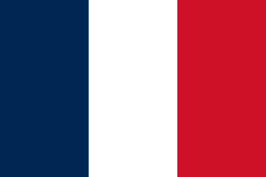
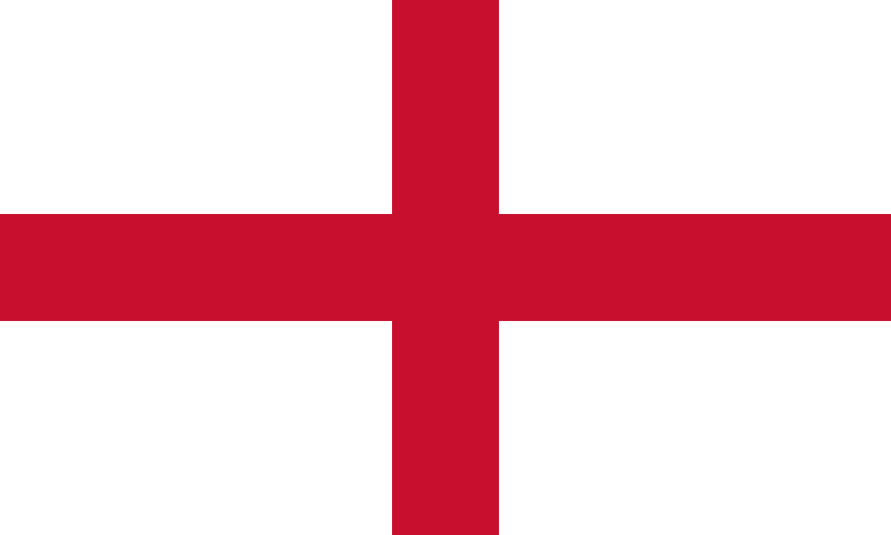
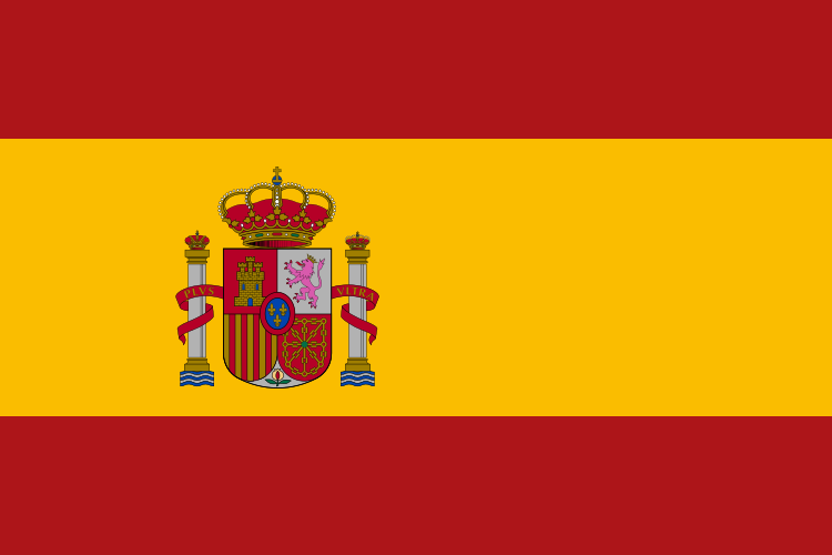
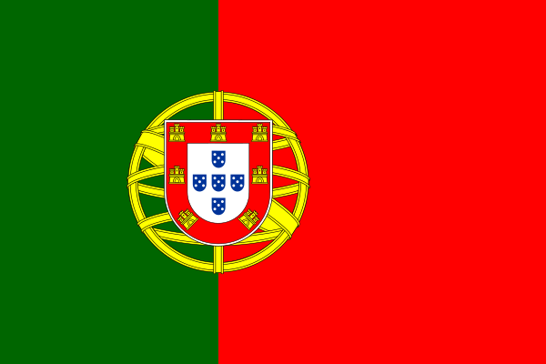
At the top, France carry the most expensive squad of the tournament at €1.52bn, a shade ahead of England (€1.36bn) and Spain (€1.22bn); Portugal, Germany and Brazil round out a top six that alone is worth more than the other forty-two nations would like to admit. At the other end, Jordan and Qatar arrive with squads valued around €20m — roughly what a single rotation full-back costs at the clubs above. The whole field adds up to about €17bn, but more than half of it sits in a dozen European dressing rooms.
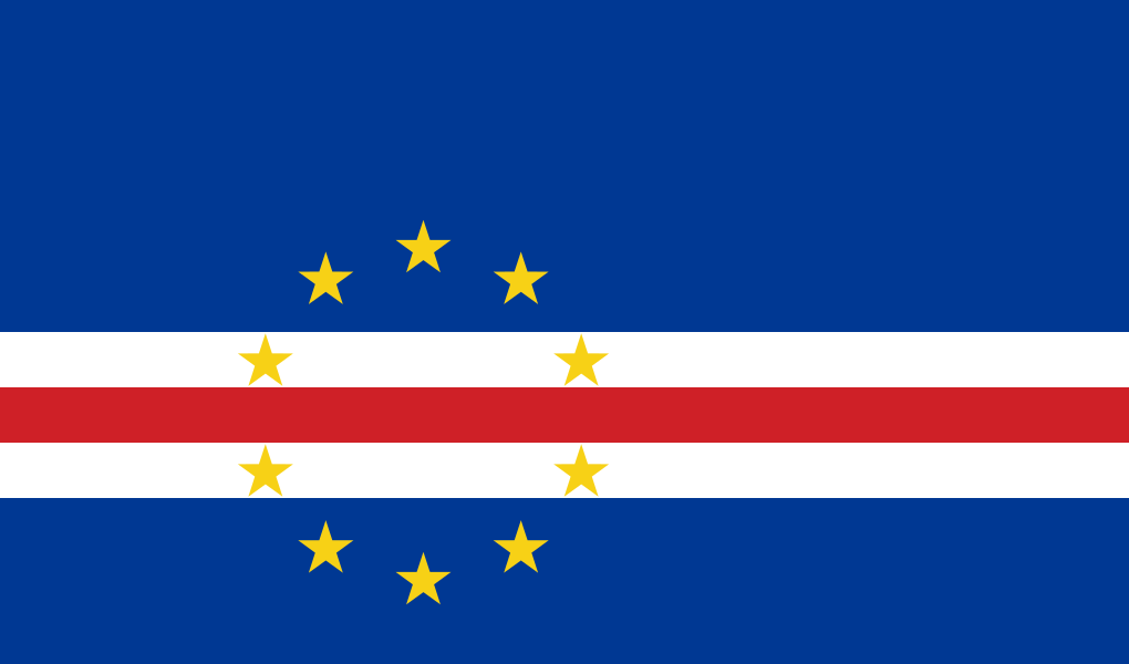
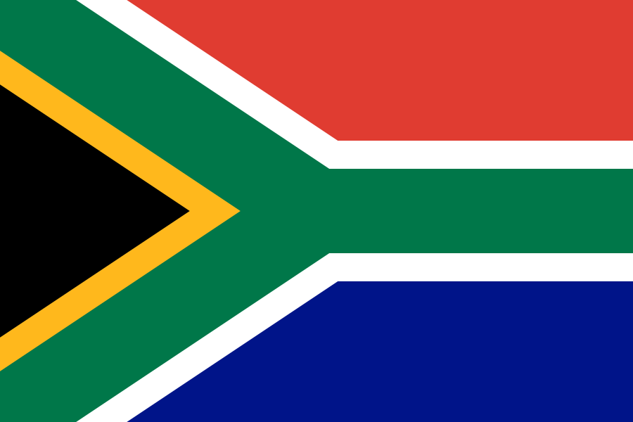
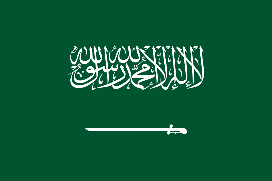
The hero map above sizes each flag by its squad's combined club value. The same ranking, in order:
The balance sheet and the scoreline
The piece began with a friendly that refused to follow the money. A single Türkiye starter was worth more than the entire team lined up against them — and lost anyway.
That is the recurring lesson of a value map: it measures what clubs have paid, not what nations can do with it. Market value is a forecast of future transfer fees, shaped by age, league and hype as much as by tournament form. A squad assembled from one domestic league — Saudi Arabia, Qatar, the South Africans at Mamelodi Sundowns — reads "cheap" on a balance sheet built around Europe's transfer market, and tells you very little about a knockout tie in July.
Why a treemap, and what it gives up
The treemap is not the most precise way to compare these squads. That is part of the point. It was chosen because the first job of this piece is not to ask whether France is exactly 1.12 times England, or whether Portugal is 7% ahead of Germany. The first job is to make the financial shape of the tournament visible at once: the blocks of money, the long tail, the strange compression of smaller football nations into the margins.
That makes the treemap a strong editorial and artistic choice. It turns the tournament into a crowded balance sheet, and the flags make the abstraction legible before the reader has processed a single number. But the form has a real perceptual weakness. As Stephen Few and others have argued, people are poor at judging relative area. We can see "large", "medium" and "tiny" quickly, but we are much worse at estimating whether one rectangle is 20%, 50% or 90% larger than another, especially when the rectangles have different shapes.
If the purpose were precise comparison, we would design it differently:
- A ranked horizontal bar chart would be the clearest way to compare country totals. Bars share a common baseline, so differences are easier to judge. It would be less beautiful, but more exact.
- A dot plot, probably on a log scale, would handle the three-order-of-magnitude spread more honestly. It would show that the bottom of the field is not merely "smaller"; it lives in a different financial universe.
- Small multiples by confederation or region would show where football economics cluster. That design would make the political geography clearer, but it would lose the shock of the whole field in one frame.
- A table, or the dossier attached to each flag, is still the right place for exact values, player lists and club detail. The graphic invites inspection; the table confirms it.
This is the judgement behind the visualisation: use the treemap for the opening argument, not for every analytical task. It gives the reader a fast sense of scale and imbalance. It does not pretend that area is the best encoding for exact comparison. A serious visual system often needs both: a memorable view that carries the story, and quieter supporting views that let the reader verify, compare and interrogate the data.
Method & sources
Squads, clubs and values are real. The rosters are the official FIFA final-26 squad lists submitted by 1 June 2026; each player's club is his club at submission, and each value is his Transfermarkt market value, collated by Datashow. Nations and players are shown in their official forms — Türkiye, Côte d'Ivoire, Cabo Verde — with the accented name and the name printed on the shirt. The group opener XI shown in each dossier is the side each nation started in its first pool match; the rest of the registered players are grouped as the rest of the squad. Each flag's area is proportional to its squad's total value.