When people talk about designing dashboards, reports or data visualisations, the conversation usually starts with the data. How should it be modelled? Which chart should we use? What filters should users have? How often should the dashboard refresh?
The choice of colours is often one of the last decisions to be made, which is interesting because colour is one of the first things people notice.
Before we read a title, scan a table or interpret a chart, our eyes have already started deciding where to look. Bright objects attract attention. Dark objects fade into the background. Groups begin to form. Patterns begin to emerge. All of this happens in a fraction of a second. Good visualisations work with this process. Poor visualisations work against it.
This article explores how colour influences the way we interpret information, why modern colour science has changed the way analytical colour palettes are designed and how we built Spectra to help designers create colour palettes that communicate clearly rather than simply looking good.
Colour is more than decoration
Imagine walking into a busy airport terminal. Hundreds of signs compete for your attention. Most disappear into the background. One bright departure board immediately catches your eye—a yellow warning sign stands out from everything around it. A green emergency exit sign is recognisable before you have even read the text. Colour is serving its purpose.
The same thing happens when someone opens a dashboard or a report. People do not read every chart from top to bottom, they scan. Their eyes move naturally towards areas that appear important before they consciously decide where to look. Good colour helps guide that journey. Poor colour forces people to stop and work everything out for themselves. Every time someone has to pause and ask “What does this colour mean?” or “Where should I look first?” it is likely a result of poor colour choices.
Not every colour should shout
Imagine a dashboard where every chart uses bright red, bright blue, bright green, bright orange and bright yellow. Every colour demands attention; nothing feels more important than anything else.
Now imagine exactly the same dashboard, but this time most colours are softer and more restrained. Only one bright colour highlights the day’s biggest issue. Without thinking, your eyes immediately know where to start. That is good visual design.
Choosing colour is not simply about selecting attractive colours. It is about deciding which information deserves attention and which information should quietly support the story. Designers sometimes describe this as visual hierarchy. Some information should naturally sit in the background. Some information should stand out immediately. Colour is one of the most effective ways of creating that hierarchy.
Rising intensity: when attention should build
We talk a lot about balancing colours to give them equal perceptual weight, but sometimes the object is exactly the opposite. Imagine a monitoring dashboard showing the health of hundreds of systems. If everything is operating normally, that is exactly what you expect to see. It should not dominate the page. What matters are the small number of services that need attention. In situations like this, the palette itself can help prioritise where people look. Rather than giving every step the same visual strength, the intensity gradually increases as the situation becomes more serious.
Soft greens quietly fade into the background.
Yellow begins to interrupt the page.
Orange becomes difficult to ignore.
Red immediately draws the eye.
Nothing about the underlying data has changed. Only the way it is presented. The result is that the dashboard naturally directs attention towards the information most likely to require action.
The CDR Ecosystem Health dashboard is a good example of this approach. Each rectangle represents a schema node found within Consumer Data Right product responses. Larger rectangles represent nodes that appear more frequently. Colour represents the level of compliance with the standard. Most nodes are fully compliant. If those large regions are coloured with the strongest green available, much of the dashboard’s visual energy is spent confirming that everything is working as expected.
A rising-intensity palette creates a much clearer visual hierarchy. Compliant nodes remain green, but the colour is deliberately softer. As compliance decreases, the palette gradually becomes more prominent. Yellow signals that something is worth checking. Orange suggests increasing concern. Red immediately highlights areas that are likely to require investigation.
The colours still communicate compliance. They now communicate priority as well. This approach is intentionally asymmetric. It works well when the measure has a clear direction and well-defined action thresholds, such as compliance, operational health, service availability, risk or overdue work. It would be inappropriate for something like election results or profit versus loss, where both sides of the midpoint deserve equal visual emphasis. In those situations a balanced diverging palette communicates the data more honestly.
Like every design decision, the palette should reflect the question the reader is trying to answer. Sometimes that question is “How do these values compare?” Sometimes it is simply “What needs my attention first?”
Colour carries meaning
Colour does not only attract attention, it also communicates meaning. A line gradually changing from light blue to dark blue suggests values are increasing. A map moving from pale yellow through orange to deep red immediately feels like intensity is increasing. A chart using blue on one side and orange on the other naturally suggests comparison.
Much of this interpretation happens instinctively. We do not consciously analyse every colour, we simply understand what it is trying to tell us.
Choosing colours carefully makes reports feel intuitive. Choosing them poorly creates uncertainty.
Why designing colour is harder than it looks
Most of us choose colours visually. We open a colour picker, move a few sliders and adjust the colours until they “look right”. For graphic design or slide decks this is often sufficient, but analytical visualisation has a different objective.
Suppose you are designing a map showing population density. If one suburb contains twice the population of another, the colours should suggest that increase naturally. If neighbouring categories represent similar values, their colours should feel like they are of a similar weight. If one colour suddenly appears much brighter than the others, readers assume the underlying data is significant in some way even though it may not be.
This is one of the reasons colour science has become such an important part of modern data visualisation.
Thinking about colour differently
Most people think about colours by their names: blue, green, purple, orange. Computers think differently—they describe colours using numbers, and it turns out there are many different systems used to describe colours using numbers. These systems are called colour spaces.
You do not need to understand the mathematics behind colour spaces. What is important is understanding that some colour spaces are designed for computer displays, while others are designed to better match the way humans actually perceive colour. That difference turns out to be incredibly important.
A circle of colour
Imagine arranging every visible colour around a circle. Start at red. As you move around the circle, red gradually becomes orange. Orange becomes yellow. Yellow becomes green. Green becomes cyan. Then blue. Then violet. Eventually you are back where you started. There is no beginning or end, it is a continuous journey through colour.
This circular arrangement is known as the hue wheel, or more commonly the colour wheel. Once you see colours this way, interesting patterns begin to appear. Colours close together feel naturally related. Colours opposite one another feel very different. Colours evenly spaced around the circle tend to be easy to distinguish. These relationships are not rules that someone invented, they are a consequence of arranging colour as a continuous spectrum.
How data visualisation uses the colour wheel
Graphic designers have used the colour wheel for centuries. In analytical visualisation we use it slightly differently. Our goal is not simply to create harmonious colour combinations, our goal is to communicate information clearly.
A sequential palette usually follows a relatively small path around the wheel because we are showing increasing values.
A sequential palette does not have to remain within a single hue. A multi-hued sequential palette can move through neighbouring hues while lightness continues to progress consistently from low to high. This can create a richer scale and extend its usable range, but lightness must continue to carry the order. Abrupt hue changes can otherwise create boundaries that do not exist in the data.
A diverging palette deliberately moves towards opposite sides of the wheel, making it immediately obvious that values are moving away from a central point.
A categorical palette spreads colours around much of the wheel so neighbouring categories remain easy to distinguish.
Once you begin thinking about palettes as paths around the colour wheel, they stop feeling like random collections of colours—every palette has a purpose.
Hue is only one part of the story
Selecting colours around the wheel is only the beginning. Imagine choosing twelve colours equally spaced around the circle. It seems logical, but unfortunately it does not produce a balanced palette because some colours naturally feel brighter than others. Yellow, for example, naturally attracts much more attention than blue.
Some colours appear more vivid. Others feel softer. Even when colours are evenly spaced mathematically, they do not feel evenly balanced to our eyes. Good palette design recognises this. Instead of treating every colour identically, designers make small adjustments so the palette feels balanced.
The goal is not mathematical symmetry. It is perceptual balance.
Three simple properties describe every colour
Modern colour science makes this much easier. Rather than thinking about colours as mixtures of red, green and blue, we can describe every colour using three simple questions.
How light or dark is it?
This is called lightness.
How vivid or muted is it?
This is called chroma.
Where does it sit on the colour wheel?
This is called hue.
Together these three properties form the basis of the modern colour space known as OKLCH. The name sounds technical but the concept is surprisingly simple. Because lightness, chroma and hue can all be adjusted independently, designers gain much finer control over how a palette behaves.
Why OKLCH matters
Older colour spaces were designed primarily for computer displays. OKLCH was designed to better reflect how people actually perceive colour. That means a small adjustment in OKLCH usually produces a similarly small visual change.
Designing smooth gradients becomes easier. Balancing palettes becomes easier. Creating predictable colour transitions becomes easier.
For analytical visualisation, that is exactly what we want.
Choosing the right palette
Different data tells different stories. The palette should support that story.
Categorical
Categories with no inherent order.
Departments. Countries. Political parties. Products.
Every category should be easy to distinguish without implying importance.
Sequential
Values increasing from low to high.
Population. Revenue. Rainfall. Temperature.
Colour should reinforce progression.
Diverging
Data centred around a meaningful midpoint.
Profit and loss. Above or below target. Election swing. Temperature anomaly.
Two directions. One neutral centre.
Cyclical
Data that naturally repeats.
Time of day. Compass direction. Wind direction. Months of the year.
The palette should wrap smoothly back to its beginning.
Bivariate and beyond
Some visualisations need to communicate two or more variables simultaneously.
These palettes become considerably more complex, requiring careful control of lightness, hue and chroma to remain understandable.
Done well, they reveal relationships that would otherwise require multiple charts.
Designing good palettes is surprisingly difficult
By this point the challenge becomes obvious. We are trying to balance multiple competing goals. Colours should be distinguishable. Attention should be directed appropriately. Transitions should feel smooth. Important values should stand out. The palette should work on screens, projectors and printed reports. Ideally it should also remain accessible for people with different forms of colour vision. There are clearly a lot of factors that go into generating an effective colour palette.
After designing visualisations across many different projects, we found ourselves asking the same questions repeatedly. Is this palette balanced? Will it work on a choropleth map? Does it still work on a scatter plot? Would reducing the chroma improve readability? Can we measure these things rather than simply guessing?
Those questions eventually led us to build Spectra.
Introducing Spectra
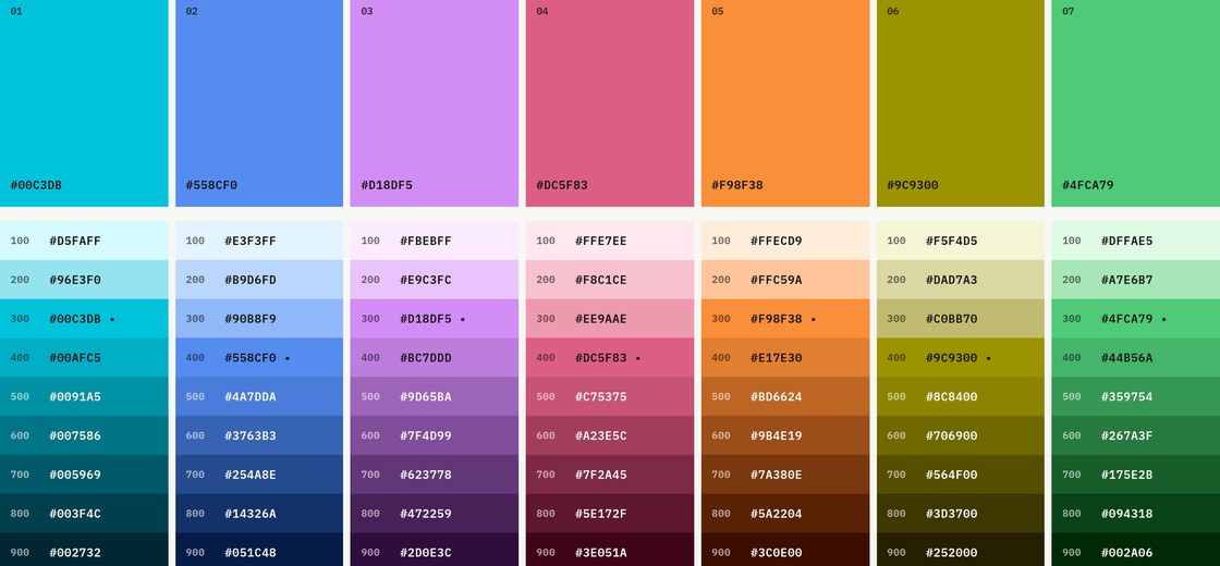
Spectra is an interactive palette designer built specifically for analytical visualisation. Rather than treating colour selection as an artistic exercise, Spectra approaches palette design as a communication problem. It allows designers to shape palettes using modern perceptual colour spaces, experiment with different palette types and immediately see the results across real visualisations.
Measuring what we usually judge by eye
One feature we particularly wanted was objective feedback. Good designers develop an instinct for balanced palettes. Beginners do not have that experience.
Spectra includes a Perceptual Scorecard that evaluates characteristics known to influence readability. Rather than asking whether a palette “looks nice”, it helps answer more practical questions:
- Are colour differences consistent?
- Does lightness progress smoothly?
- Are neighbouring colours sufficiently distinguishable?
- Does the palette maintain good visual balance?
It does not replace judgement. It supports it.
See it on real charts
The final step is applying a palette to real visualisations. A palette that looks beautiful as a strip of coloured rectangles may behave very differently on a map, treemap or heatmap.
Spectra allows every palette to be previewed across the complete Datashow Chart Index. Instead of guessing whether a palette works, designers can see it applied across dozens of chart types before making a decision.
Design becomes faster. Consistency improves. Unexpected problems become much easier to spot.
Better colour leads to better communication
Colour is not simply about making dashboards look better, it is about making information easier to understand. Good palettes reduce visual clutter and naturally guide the viewer’s attention. They communicate meaning consistently, and they help people reach decisions with greater confidence.
That is why we built Spectra—not to generate attractive colours, but to help create visualisations that communicate more clearly.