What is an agglomeration?
An urban agglomeration is the continuous city that exists beyond the lines on an administrative map. Municipal borders describe governments. Agglomerations describe lived urban form: the dense centre, connected suburbs, satellite centres and transport corridors that operate as one metropolitan system.
The distinction matters whenever cities are compared. One municipal boundary may stop at the historic core while another reaches far into its rural fringe. That can make one city appear compact and another enormous even when their actual urban footprints tell a different story. Here, the population surface—not the council line— reveals where the city gathers and where it thins away.
Urbica's study of urban agglomerations
Between 2016 and 2017, Urbica conducted The Age of urban agglomerations for Moscow Urban Forum 2017. The study assembled population, employment, commuting, urban development and environmental data in an interactive comparison of major international and Russian agglomerations. Urbica published its account of the work on 13 July 2017, immediately after the Forum.
The study used a functional definition rather than a municipal one. Its core began with one-square-kilometre cells containing more than 1,500 residents. Its periphery included municipalities where at least 15 per cent of employed residents regularly travelled into that core for work or study. Where official commuting statistics were missing, the researchers used anonymised mobile-network data to estimate those movements.
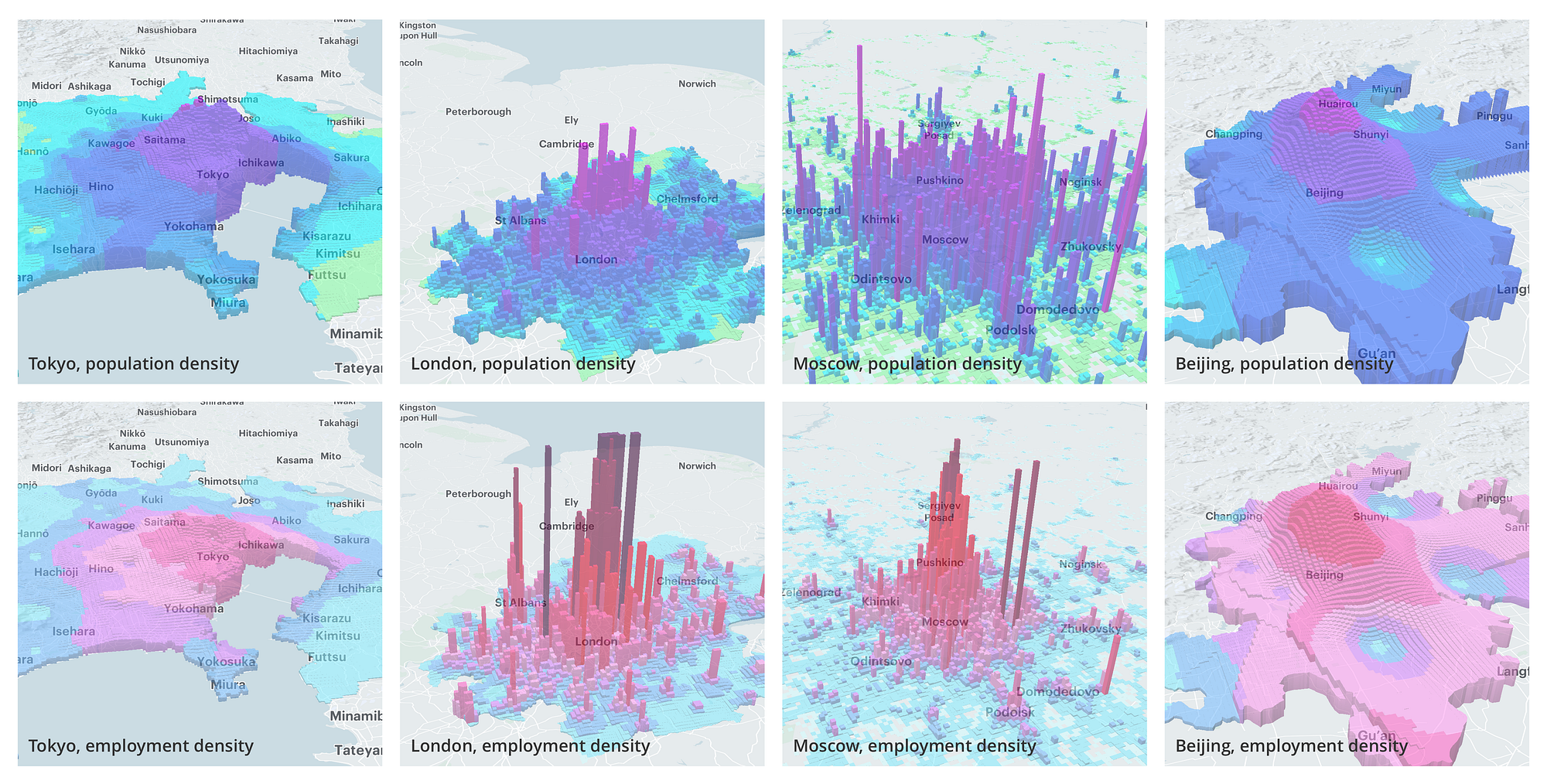
The paired population and employment surfaces revealed materially different metropolitan structures. Tokyo's residents were distributed comparatively evenly across an exceptionally large agglomeration. Moscow's population was much more concentrated inside its core, while employment remained strongly focused on Moscow proper, placing pressure on radial transport between the capital and its suburbs. London combined one of the world's highest central employment densities with substantial second-order centres, producing a more polycentric structure than Moscow.
Extending the study
This explorer adopts Urbica's central visual argument: population becomes easier to compare when it is treated as a continuous surface rather than contained by administrative boundaries. It extends that argument through a hierarchical global grid, a historical series and consistent worldwide coverage.
The first extension is spatial. We use H3, Uber's hierarchical geospatial index, rather than a square-kilometre grid. H3 projects a spherical Earth onto the twenty faces of an icosahedron, lays a predominantly hexagonal grid across those faces, and assigns every cell a stable hierarchical address. Each finer resolution has cells approximately one-seventh the area of the preceding resolution. The explorer can therefore serve neighbourhood-scale cells nearby and progressively coarser cells as the map pulls back, without changing the underlying indexing system.
The second extension is temporal. The live surface contains 35 annual frames from 1990 through 2024: a 34-year interval in which both the amount and spatial distribution of population can change, while prosperity changes with the annual regional PPP series. Urbica's comparative views established the value of looking across cities; the timeline adds the ability to examine how each city changes within itself.
The third extension is coverage. Population density and prosperity are prepared as one consistent worldwide H3 surface, giving every city in the global catalogue the same units, resolutions, height reference and colour grammar. Melbourne can therefore be compared with Mumbai, Hobart with Dhaka, or Sydney with Lagos without rebuilding the method for each place.
Representing population as an H3 surface
Every city is divided into H3 hexagonal cells. Hexagons provide a consistent worldwide unit and avoid suggesting that an administrative boundary is the natural edge of a city. At close range the explorer shows resolution-8 cells, each roughly neighbourhood-sized. At wider scales those cells are folded into broader serving levels so the overall shape remains readable without loading millions of hexagons.
Height carries population concentration. It is not building height and it is not a claim about the physical skyline: taller columns indicate a higher average population across the resolution-8 cells contained within the displayed hexagon. At resolution 8 that is the population of the cell itself. At coarser serving levels the average preserves the density encoding and prevents towers growing merely because the map has folded several cells together; the tooltip reports the aggregate population inside the larger cell. Every city uses the same worldwide reference. A gently shaped scale keeps low and middle values visible while preserving differences at the upper end; Cairo remains materially taller than Melbourne rather than every viewport being normalised to the same maximum height.
Deriving population and prosperity
In this explorer, prosperity means estimated real economic output per resident, adjusted so that purchasing power can be compared between countries. Operationally, the measure is real GDP per person at purchasing-power parity, expressed in constant 2021 international dollars. It is a measure of material economic scale, not household wealth, disposable income or wellbeing.
No single source observes that measure alongside population at neighbourhood scale for every city and every year. We therefore combine datasets at the scales they can support rather than presenting a modelled H3 value as a direct observation. The table separates the cadence of the values used in the lab from the spatial detail each source contributes.
| Source | Temporal cadence | Spatial granularity | Use in the lab |
|---|---|---|---|
| GHS-POP R2023AEuropean Commission Joint Research Centre | Five-year source epochs; the lab uses 1990, 2000, 2010, 2020 and 2025 | 100 m raster, aggregated to H3 resolution 8 | Sets population at the five anchor years. Each H3 cell is interpolated between anchors to create the annual population surface. |
| GDP per person at PPP, version 4Kummu, Kosonen and Masoumzadeh Sayyar | Annual values, 1990–2024; source releases are versioned, not guaranteed annually | Second administrative level (ADM2) | Sets the absolute regional prosperity level in constant 2021 international dollars. It is not a city or neighbourhood series. |
| Kontur Population2023 reference surface | One current reference snapshot | H3 resolution 8, about 0.74 km² per cell on average | Provides the fine H3 reference grid and population weights used to normalise the prosperity allocation inside each ADM2 region. |
| Relative-prosperity inputsABS SEIFA, US ACS, English IMD, Eurostat and Meta RWI | Latest source snapshot; generally 2019–2022, not an annual history | SA1, census tract, LSOA, NUTS3 or approximately 2.4 km RWI cells | Ranks areas within each country and allocates regional PPP across H3 cells. These inputs never set the absolute prosperity level. |
| World Bank fallbackGNI per person at PPP, or GDP per person where GNI is unavailable | Annual national series; latest available value when the seed is built | Country, varied locally with population-density rank | Fills gaps only when a finer source is absent. It is deliberately lower priority and is replaced when a better local source is available. |
Population from GHS-POP
The population surface begins with the European Commission's GHS-POP R2023A. It estimates resident population on a global 100-metre grid by disaggregating census and administrative totals with the changing distribution, volume and character of built-up land. Historical epochs through 2020 are estimates; 2025 is a projection.
The current seed uses the 1990, 2000, 2010 and 2020 grids and the projected 2025 grid. We sum the source pixels into resolution-8 H3 cells, then interpolate each cell—not merely the city total—for every year from 1990 to 2024. The 2024 surface is therefore four-fifths of the way from the 2020 estimate to the 2025 projection. This lets the shape of a city expand and redistribute through time, but it also smooths changes between source years. Intermediate years should be read as modelled annual positions rather than separate population censuses.
Why use purchasing-power parity?
Comparing currencies at market exchange rates does not tell us how much those currencies buy where people live. Housing, transport, health, education and many other services have very different local prices and are not traded internationally. Purchasing-power parities, or PPPs, use international price comparisons to convert economic output into a common unit while controlling for those price-level differences. In the World Bank's International Comparison Program, the comparison is built from a common basket of goods and services. One international dollar is intended to represent equivalent purchasing power across economies, not the number of US dollars obtainable at a foreign-exchange counter.
We use real GDP per person at PPP because it provides a more defensible common basis for comparing the material economic scale of cities in different countries and years. “Constant 2021 international dollars” does not mean nominal US dollars in 2021, 2024 or today. It means that every year in the series has been rebased to the purchasing power and price level of the same 2021 reference system. A 1990 value can therefore be compared with a 2024 value without ordinary inflation or a changing PPP vintage being mistaken for real growth.
The explorer does not continually inflate those values into the latest calendar-year dollars. When a new PPP basis becomes the authoritative source, the honest approach is to regenerate the complete 1990–2024 history on that one basis, not splice a newly rebased endpoint onto the old series. GDP per person still remains an approximation: it says nothing about how output is distributed between households, and it does not include many dimensions of wellbeing, inequality or access to public services.
From regional PPP to an H3 surface
The absolute control comes from Kummu, Kosonen and Masoumzadeh Sayyar's global GDP-per-capita dataset. Its fourth release provides annual values from 1990 to 2024 at the second administrative level, or ADM2. It is not a city-level PPP series: an ADM2 region may contain a city and its surroundings, while a large agglomeration may cross several ADM2 regions. The authors combine reported subnational GDP where it is available with a global downscaling model elsewhere. The values are annual, but new public releases do not follow a guaranteed annual schedule; each seed records the Kummu version from which it was built.
Painting one ADM2 average uniformly across a city would erase most of its local structure. We instead use the fine-scale wealth surface attached to the Kontur H3 grid as an allocation signal. Its inputs include Meta's Relative Wealth Index for many low- and middle-income countries, together with official local sources where they are available: ABS SEIFA in Australia, US Census ACS income, the English Index of Multiple Deprivation and Eurostat regional GDP. Remaining gaps use a lower-priority World Bank national-income and population-density proxy. These inputs differ in concept, date and spatial resolution, so their raw scores are never compared directly. Each is converted to a within-country relative rank before it influences the local allocation.
Each cell's rank becomes a positive prosperity multiplier. We divide that multiplier by the population-weighted mean multiplier for its ADM2, then multiply it by the region's Kummu PPP value. In compact form: local prosperity equals regional PPP multiplied by the local multiplier, divided by the regional population-weighted multiplier. The resulting cells can vary within the region, while their population-weighted mean reconciles exactly to the regional control. Where a city crosses an ADM2 boundary, each H3 cell is reconciled to the region that contains it. The process redistributes the known economic total; it does not create additional output or pretend that Kummu observed neighbourhood GDP.
How to compare the estimates
Side-by-side comparison is strongest at the scale the sources support. Every city uses the same H3 system, constant-dollar PPP basis and population-height reference. The city card reports a population-weighted median prosperity, so a sparsely inhabited affluent cell cannot dominate the summary. Large differences in metropolitan population, density and regional prosperity are therefore meaningful to compare, as are broad patterns of concentration within a city.
Exact neighbourhood-to-neighbourhood dollar comparisons require more caution. The fine allocation layer is a relative model assembled from sources with uneven coverage, and the same local allocation weights are held constant from 1990 to 2024. Annual colour change reflects Kummu's changing regional PPP level, while the historical geography of local advantage is not independently re-observed each year. Administrative boundaries can also leave visible edges in the estimate. The current explorer does not render Kummu's uncertainty fields, so small differences should not be treated as precise rankings. The map is designed to expose structure and change at comparable scales, not to assign an exact income or standard of living to a household.
This derivation happens once before publication. Source versions, reference years, interpolation weights and processing versions are kept with the data, and the finished annual H3 surface is validated and written as a versioned Parquet seed. ClickHouse loads that surface and folds it to coarser H3 levels; a map request performs no raster reads, spatial allocation or annual interpolation.
Understanding choropleth maps
A choropleth is a map made from repeated geographic areas—countries, electorates, census districts or, here, hexagons—where each area is filled with a colour determined by a number. The colour does not locate an individual person or building. It summarises the value for the whole area. A legend is therefore essential: it tells us which values the colours represent and in which direction the scale runs.
Although our hexagons also rise into columns, their colour follows this choropleth logic. The map can use a univariate palette to show one measure, or a bivariate palette to combine two. Those words sound technical, but the distinction is simply one question versus two.
More precisely, a choropleth makes four choices. It divides the map into comparable areas; assigns one value to every area; sorts those values into classes; and gives every class a distinct fill. Here the repeated areas are equal-resolution H3 cells, so a colour difference is not being caused by one district simply covering more land than another. Population density and prosperity are also more suitable than raw totals because they describe the condition inside each cell.
Classification materially affects how the map is interpreted. Equal intervals emphasise absolute distance, quantiles put similar numbers of areas into each class, and policy or scientific thresholds can mark values with a known meaning. This map uses separate references for its two colour axes. Population density is compared with urban cells worldwide, while prosperity is compared with cells in the same country. Both references are recalculated for every year and H3 resolution, so the colour range remains legible when broad cells replace fine ones and each historical slice is compared with its contemporaries. Panning at a fixed year and resolution does not recolour unchanged cells.
Population density as a univariate choropleth
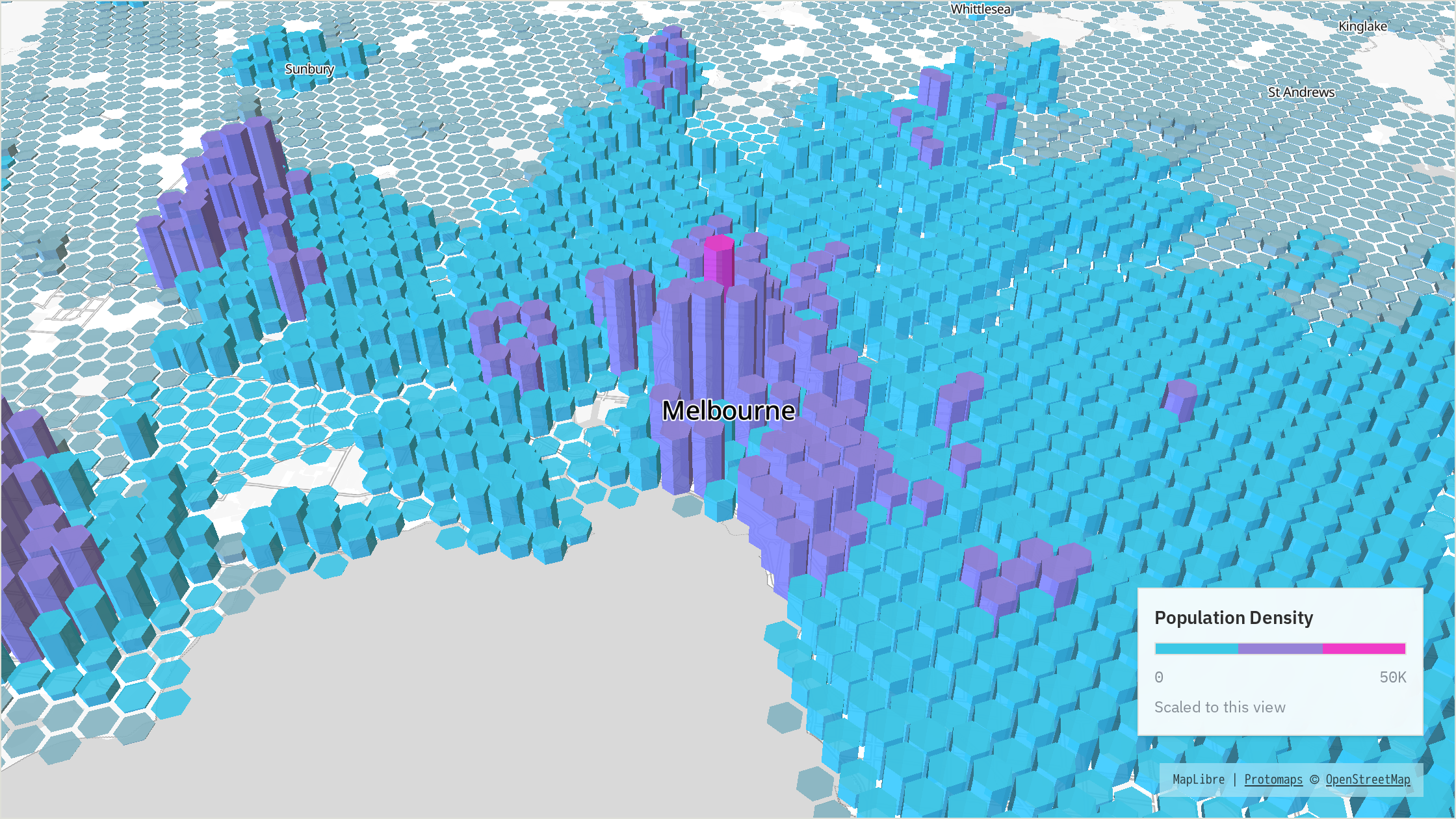
A univariate choropleth asks one question and uses one ordered set of colours. In the population-density example, a cell is first placed into one value interval, then receives that interval's colour; two values inside the same interval look identical. The steps are deliberate. A smooth gradient would show the direction of a scale, but it would hide the act of classification that defines this example as a choropleth.
The three discrete classes begin in cyan and move towards magenta as density increases. Height also represents population concentration, but the colour classification can be read independently from the columns. The Melbourne map immediately below uses this palette while holding the camera, population surface, year and height scale fixed.
Prosperity as a univariate choropleth
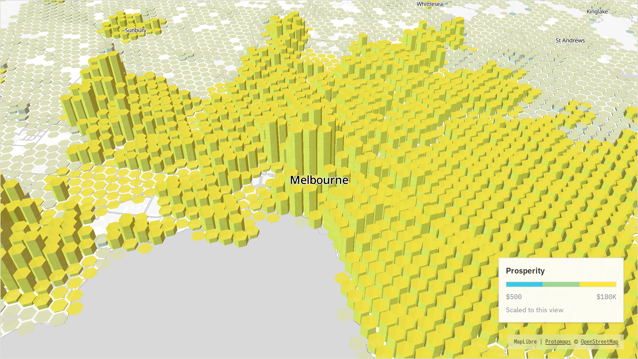
The second univariate view asks a different single question. Each H3 cell is classified by its within-country prosperity percentile at the current H3 level, with lower classes in cyan and higher classes moving towards yellow. Population density no longer affects colour, although it continues to determine column height.
The Melbourne map uses the same cells, camera, population surface and height scale as the density view. The only change is the variable used to assign colour. Comparing the two maps therefore isolates the information contributed by each univariate encoding before they are combined.
Combining density and prosperity
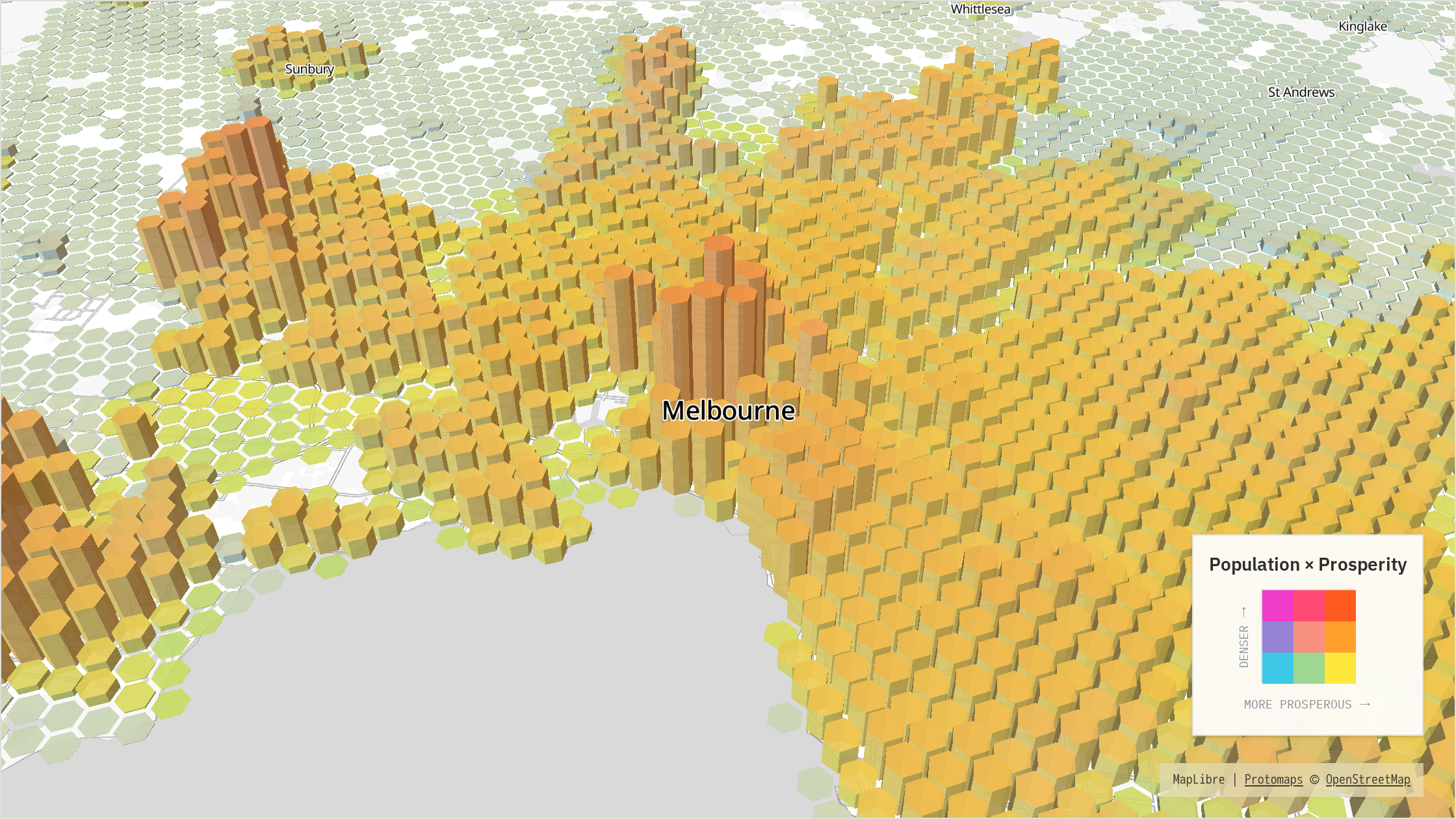
A bivariate choropleth classifies two variables separately and crosses the results. Three density classes multiplied by three prosperity classes produce nine joint classes. Read the legend like a small table: choose the cell's density row, choose its prosperity column, and the square where they meet is its map colour. Density increases upwards in this legend and prosperity increases to the right. The bottom-left square is low–low; the top-right square is high–high.
people
prosperous
Constructing the bivariate palette with additive colour
The default palette begins with a shared low–low base colour B, then defines a density colour D and a prosperity colour P. For class positions d and p, the combined colour is B + d(D − B) + p(P − B), with RGB channels clamped to their valid range. In plain language, move up the matrix and add the density shift; move right and add the prosperity shift. The high–high corner receives both shifts.
This is additive construction from a common base—not transparent layers placed over one another, and not a simulation of mixing paint. The default anchors are cyan for low–low, magenta for high-density and low-prosperity, and yellow for low-density and high-prosperity. Applying both shifts produces the warm orange-red high–high corner. The two source ramps remain recognisable along the outside edges, while the interior colours communicate combinations rather than a third variable.
The final Melbourne view applies the combined matrix to the same map. Each cell takes its row from population density and its column from prosperity. The resulting colour can therefore be traced back to the two univariate classifications shown immediately above.
Interpreting the colour and height encodings
The three-by-three figure shows the classified bivariate encoding. The live lab samples between those nine reference colours so annual changes can move through the field without every cell flashing across a hard class boundary at once. The legend therefore acts as an orientation matrix: first locate a colour vertically for density, then horizontally for prosperity. The map's height repeats population concentration, which helps separate a genuinely dense district from a colour that is being driven mainly by prosperity.
A bivariate map trades numerical precision for spatial pattern. It is useful for finding dense but less prosperous districts, prosperous low-density fringes, and places where both measures are high. It is not a lookup table for exact values, and it does not establish that one variable causes the other. Exact values remain available in the city card and distributions; the matrix is intended to show how the two measures vary spatially.
Alternative schemes change the colour anchors, not the encoding structure. We keep univariate and bivariate palette families separate so a decorative choice cannot silently change how many variables are encoded.
Reading the city examples
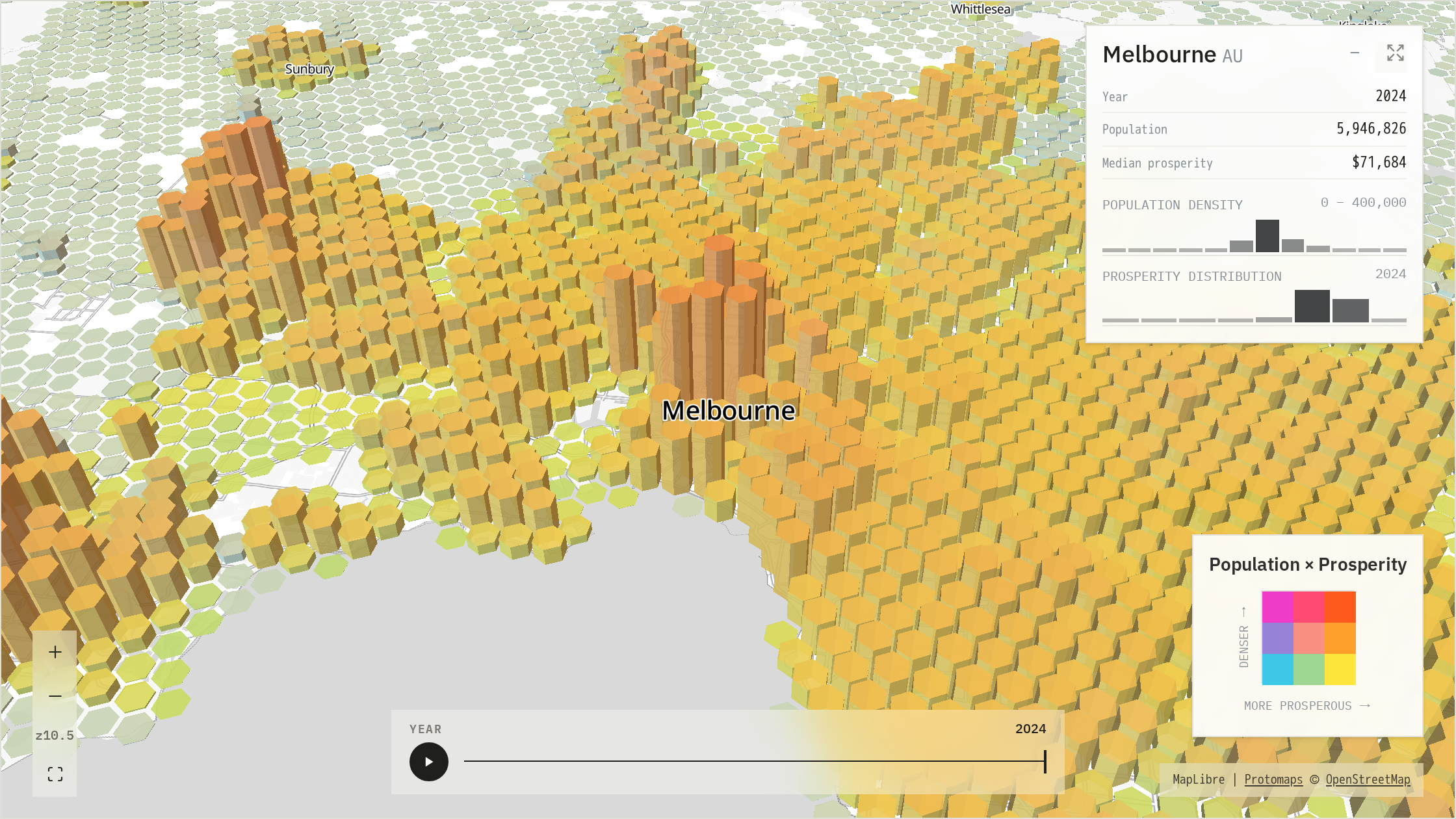
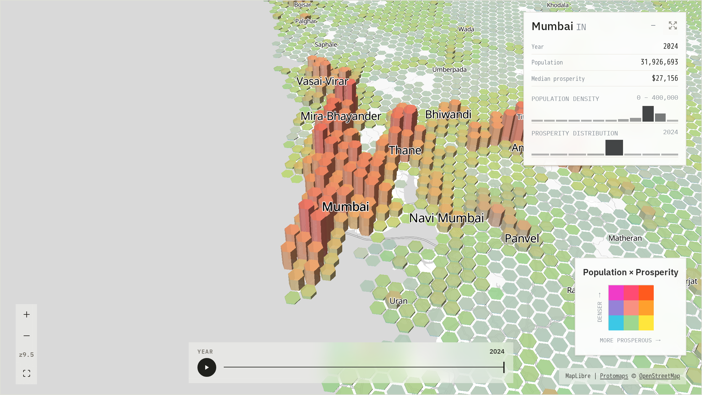
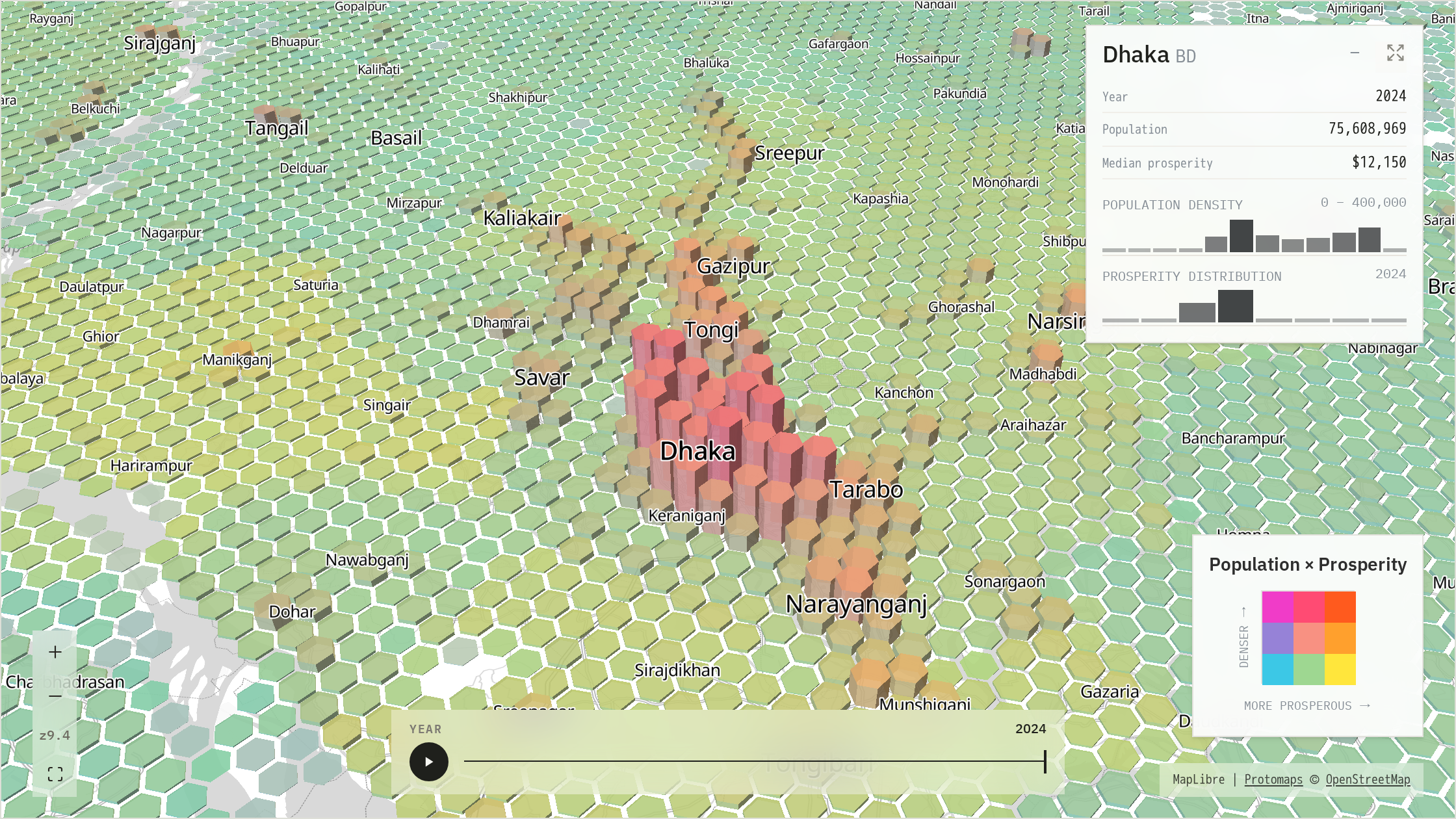
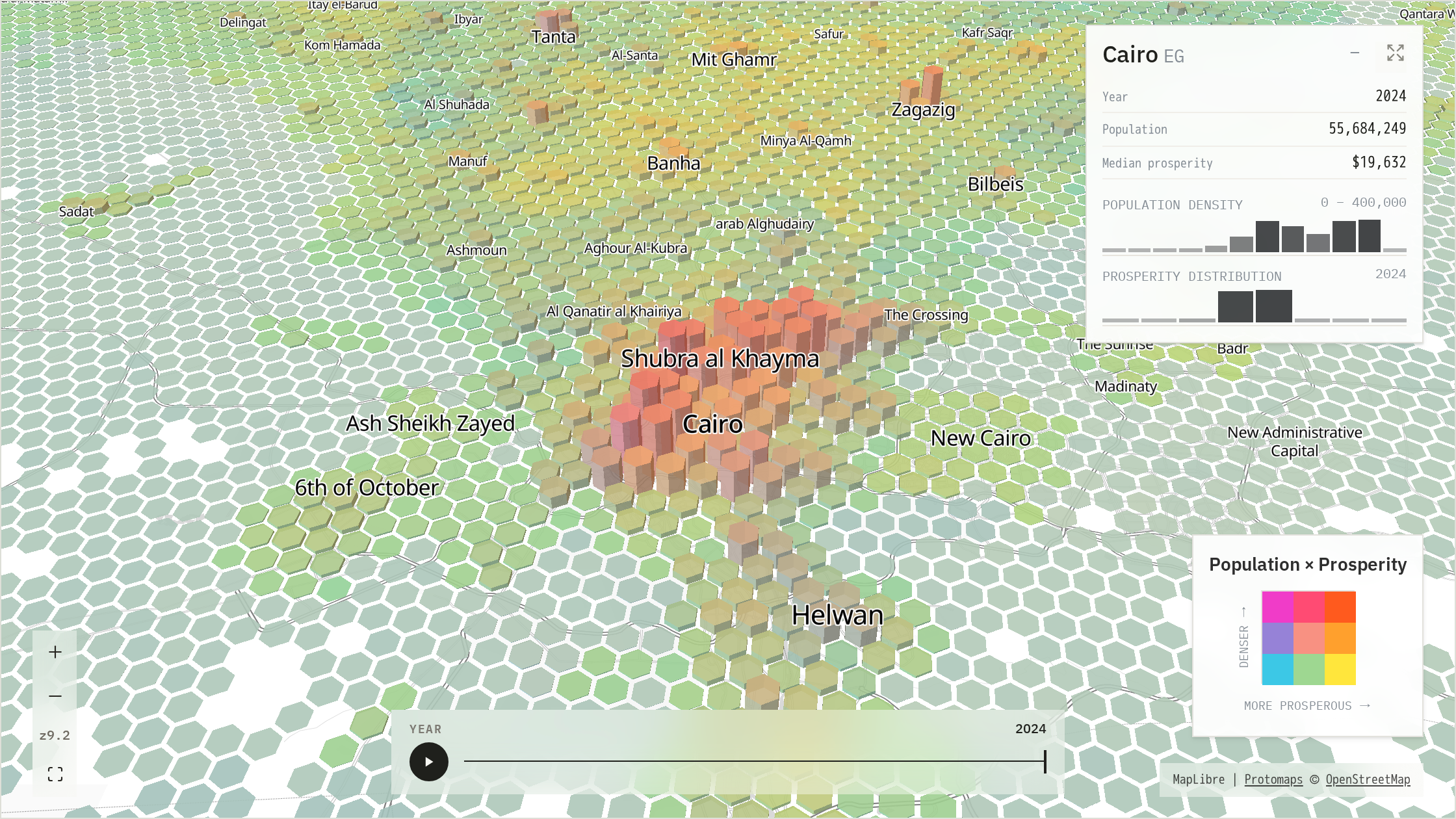
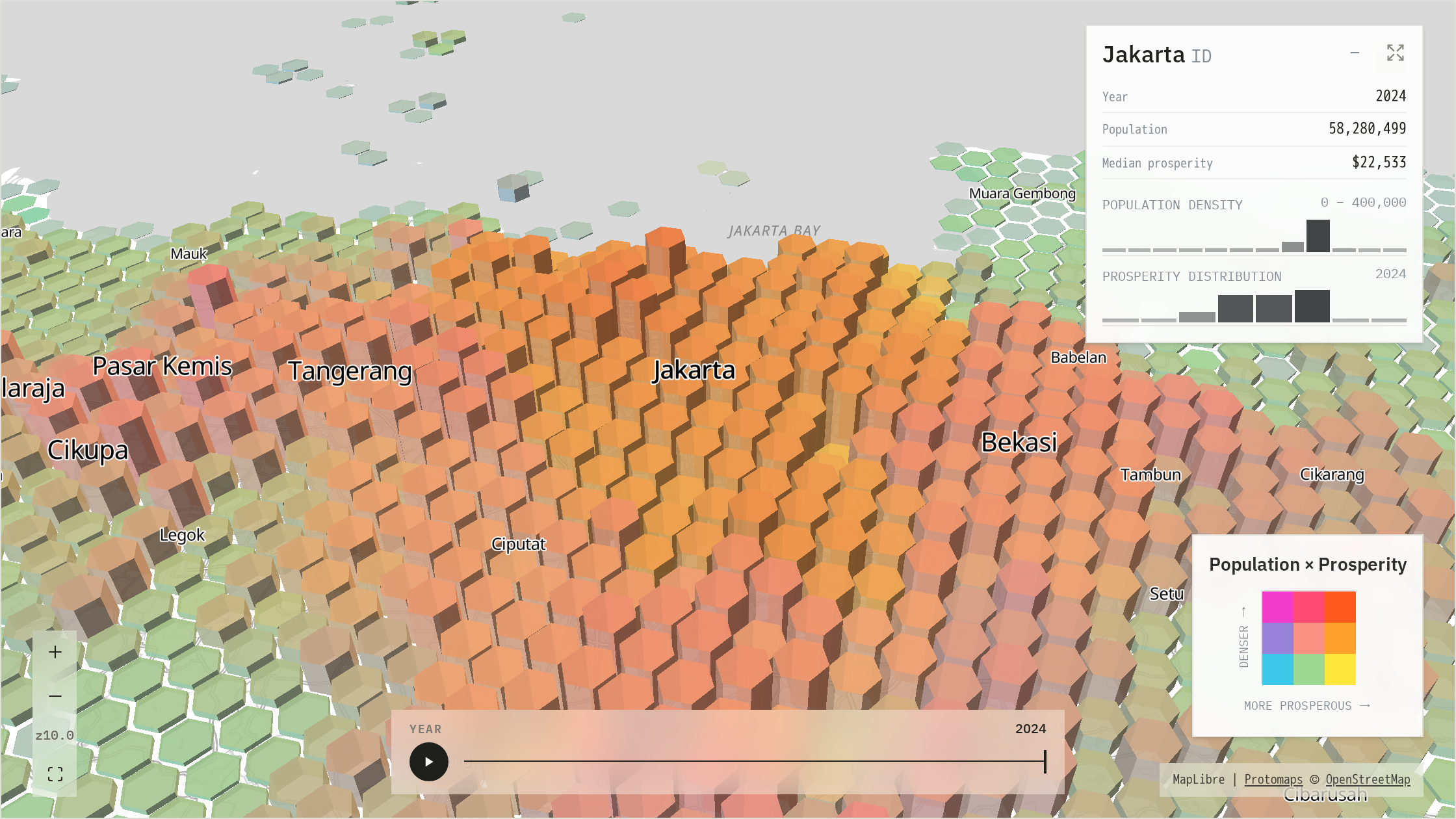
A useful reading order is height, then colour, then shape. Height establishes how concentrated the population is. The vertical direction of the colour matrix checks density again; its horizontal direction adds prosperity. Finally, the arrangement of cells reveals whether the city is compact, linear, fragmented or polycentric. Move through the five examples below with the position chips or a horizontal drag. Select any image to open the full gallery.
Patterns across cities
Population totals and peak density describe different properties. Melbourne has a recognisable central ridge but gains much of its scale from breadth. Jakarta is vastly larger and more continuous without producing Cairo's near-maximum summit. Mumbai and Dhaka combine both extent and sustained intensity. A city can therefore become enormous by spreading, by concentrating, or by doing both.
Physical geography remains visible in the population surface. Mumbai's peninsula, Cairo's river and delta, Sydney's harbour and the waterways of Manila and Lagos all create absences, edges and corridors in the surface. These are not decorative gaps. They show where growth was channelled, interrupted or forced to leap across a constraint.
Polycentric urban patterns are common. Jakarta presents a field of centres rather than one dominant spike. Delhi sustains density across an immense grid; Melbourne's outer ridges mark secondary concentrations; and the Pearl River Delta is better understood as a connected urban region than as one centre with a surrounding fringe.
Prosperity estimates require cautious interpretation. Kummu PPP supplies the comparable absolute regional level; the fine-scale relative-wealth surface supplies only the spatial allocation inside that region. The resulting H3 estimates are modelled, not direct observations of neighbourhood GDP. The map is strongest for seeing how a regional economic level may be distributed across an urban form and for forming questions, not assigning causes from colour alone.
Comparing cities in the explorer
The explorer is most revealing when two cities share a camera. Open Compare, choose a second city and keep the views synced. Panning one panel applies the same geographic offset to the other; zoom, pitch and bearing move together. The comparison is therefore about the cities, not two unrelated map settings.
The Featured rail jumps to cities worth a look, while the metric and colour controls let the surface be tested as population-only, prosperity-only or bivariate. Full screen removes the surrounding article when closer inspection is required. These controls allow the same measures to be tested across different urban forms without changing the underlying visual definitions.