A market in motion.
Box-office tables are good at answering one question: what is number one? They are less successful at preserving the texture of a moment—which films were competing for attention, which arrived together, which grew slowly through word of mouth, and which disappeared before the advertising had left the street.
Marquee began with the idea that the cinema market is not a leaderboard but a moving system. Almost thirty years of daily US theatrical grosses, from June 1997 to the present, become a field of films entering, gathering momentum and eventually leaving the screen.
The visualisation is designed to support several conversations at once: which films were the biggest of their time, what they opened against, how long they remained in cinemas, which forgotten titles briefly commanded the market, and which expensive bets never became the event their budgets implied.
Why a force-directed bubble chart?
The chart deliberately separates accumulated success from current momentum. Size represents a film’s cumulative domestic gross to that date. Daily rank controls its attraction to the centre and its collision mass. Colour identifies genre, while the poster supplies the identity that a generic mark cannot. Time provides the final encoding: arrival, growth, displacement and departure.
This means a large bubble is not necessarily the most powerful object in the field. An older blockbuster may still carry an enormous cumulative gross while earning very little today. A smaller opening film can take the top rank, move towards the centre and push the established hit outward. One measure tells us what a film has accumulated; the other tells us what it is doing now.
There is no fixed x- or y-axis. Position is emergent rather than exact: centrality is evidence of rank-weighted attraction, not a coordinate to be measured. That makes the form particularly good at showing dominance, competition and turnover, but less suitable for reading precise differences. Exact figures remain available in the film card and dossier.
The problem with area.
Circles are inviting, compact and naturally suited to a collision system. They are also perceptually weak. People judge length much more accurately than area, and a circle that has twice the area does not look unambiguously twice as large. Posters complicate the comparison further because a bright, high-contrast image can appear more prominent than a quieter image of the same size.
A mathematically literal bubble chart would use a square-root scale so that area remains proportional to gross. In testing, that made most films appear to reach nearly their final size during opening week. The numbers continued to grow, but the visible change became too subtle to follow.
Marquee therefore uses a 0.75 power scale for radius. It creates more separation than an area-proportional scale and leaves room for a successful film to visibly grow after opening. Small films receive a legibility floor, the largest film receives a viewport-relative ceiling, and every date is normalised to the largest film in that tableau. These are perceptual compensations, not claims of literal area.
A square-root radius keeps circle area mathematically proportional, but the smaller film still looks relatively large.
Extra separation makes growth and rank changes easier to see, while a minimum radius keeps the smallest films present.
Normalising each date also answers “biggest of its time” more fairly. A dominant film from 1998 can occupy the field as confidently as one from 2019, despite decades of ticket-price inflation and market growth. The trade-off is important: identically sized bubbles on different dates do not represent identical dollar totals.
Making rank physical.
Keeping the top-ranked films at the centre sounds simple until bubbles begin colliding. A conventional force simulation treats a large circle as a large physical body. That allowed an older, low-ranked blockbuster to occupy the centre simply because its collision radius was enormous, while a small new number one bounced around its edge.
Marquee gives each film a separate, rank-derived mass. The number-one film has the strongest central attraction and the greatest inertia; mass then falls with the square of rank. Size still determines how much space a film occupies, but rank determines which film yields in a collision. A small opening hit can therefore displace a much larger film whose daily takings have slowed.

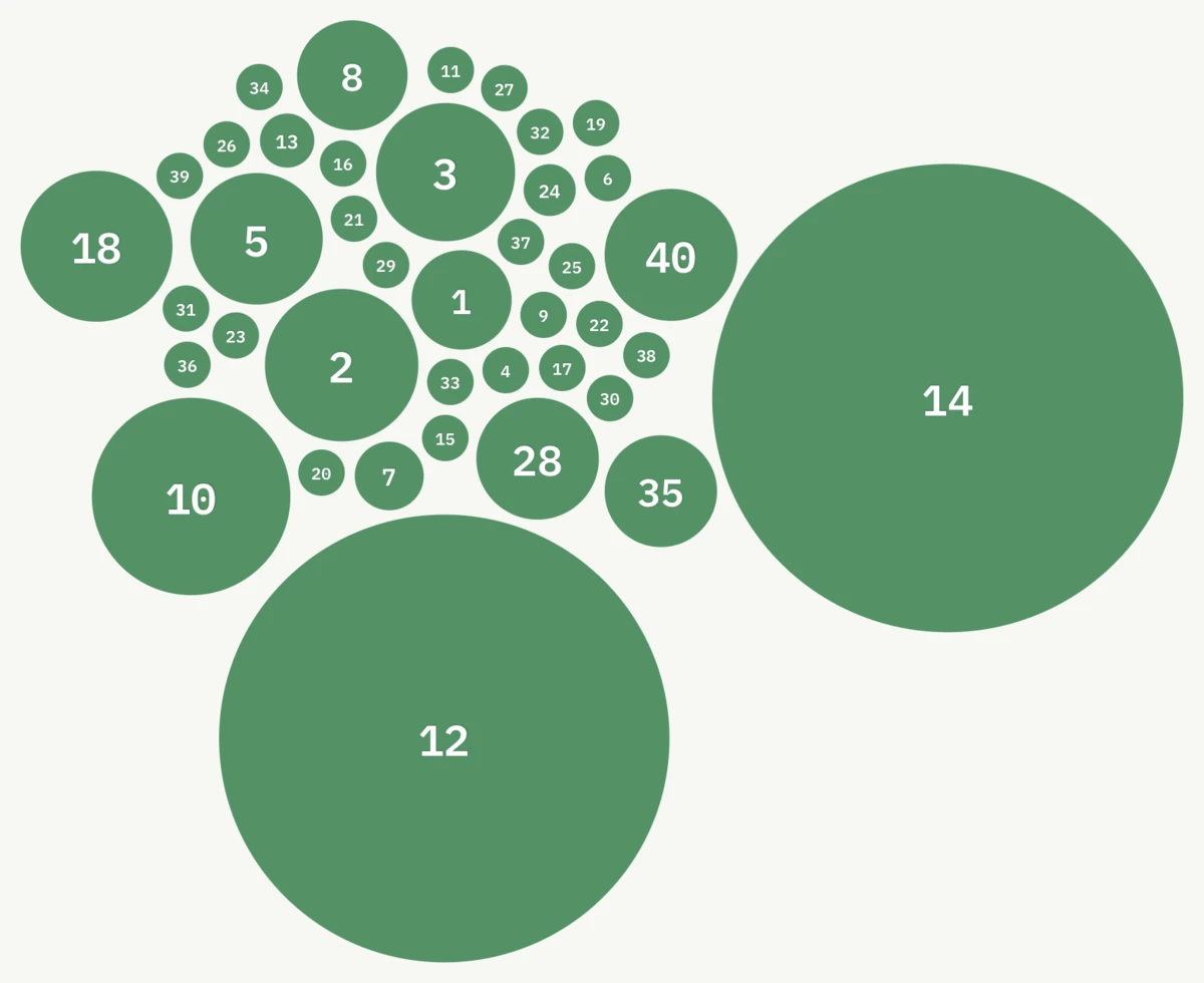
The simulation preserves position and velocity from one day to the next, then gently reheats as new data arrives. This continuity is what makes the cluster feel like one evolving market rather than thousands of unrelated layouts. When the timeline is scrubbed, a separate short transition settles the destination first so the chart can move quickly without exploding and reforming.
Movement is data.
Motion is not an ornamental layer placed over the chart. It carries release status. New films begin beyond the edge of the canvas and accelerate towards the cluster, reaching its boundary as their first screening date arrives. Films that stop charting lose their central gravity and peel towards a stable off-screen target.
Arrivals are prevented from disturbing the live cluster before release. Departing films yield to active ones rather than bulldozing through them. A seven-day grace window bridges short gaps in event screenings, avoiding the distracting spectacle of a film leaving one day and snapping back the next.
Playback speed changes the clock, not the physics. The same number of simulation steps represents a theatrical day at 1× and 7×, so increasing the speed compresses the story without changing who reaches the centre or how an arrival meets the pack. The same information remains available in still frames and exact figures, while fullscreen and loading flourishes respect reduced-motion settings.
What to look for.
Start with the centre, then watch the edges. The centre shows the films winning the current day. Bubble growth reveals cumulative success. Simultaneous arrivals reconstruct crowded release weekends, while the edge records the long tail: specialist films that persist, former hits whose runs are ending, and titles that never acquire enough momentum to enter the cultural memory.
Franchises appear as rhythm rather than a separate category. The annual Harry Potter releases, three successive Lord of the Rings Christmases, the return of Star Wars and the accelerating cadence of the Marvel Cinematic Universe all arrive as repeated attempts to take possession of the same centre. Seen at speed, the franchise era is not an abstract industry trend; it is a pattern of recurring gravitational events.
Shared dates create their own stories. Titanic and Tomorrow Never Dies opened together in December 1997. The Dark Knight and Mamma Mia! did the same in July 2008. Barbie and Oppenheimer turned that coexistence into the premise of an entire weekend in 2023. Marquee restores the neighbours that an all-time chart removes.
Highlights worth seeking out.
The following moments are useful starting points, not a complete ranking. Grosses are cumulative domestic takings in nominal US dollars. Run length refers to continuous presence in the daily source, with short screening gaps bridged.
Star Wars: The Force Awakens
The largest cumulative domestic gross in Marquee’s nominal-dollar history, ahead of Avengers: Endgame at $858.4m.
Barbie and Oppenheimer
Both opened on 21 July 2023. Their combined domestic runs made one weekend feel like a cultural double feature.
Oppenheimer
Its first theatrical run remained on the daily chart for roughly eight months—longer than Avatar, The Dark Knight or Top Gun: Maverick.
Under the Sea 3D
Museum and IMAX documentaries follow a different theatrical clock. This one stayed visible for almost two years.
Avengers: Endgame
A decade of connected releases culminates in one of the clearest examples of a franchise taking possession of the centre.
Mortal Engines
A reported $100m production budget met a much smaller domestic run. Marquee does not label flops, but the mismatch is difficult to miss.
Remembering the near misses.
Marquee does not contain a “flop” switch, and it should not. Profitability cannot be inferred from domestic gross alone: international revenue, marketing, distribution terms and ancillary income all matter. Production budgets are also reported estimates rather than audited accounts.
Even so, a small bubble beside a large reported budget can recover a surprisingly vivid memory. Mortal Engines, Mars Needs Moms, Dark Phoenix, Tomorrowland and dozens of forgotten would-be franchises return not as a judgement but as a question: what did the industry expect this film to become, and how quickly did the audience answer?
Where Marquee goes next.
The current view is organised around films, releases and theatrical performance. The underlying data already connects many of those films to actors and directors. A people view could reveal a different kind of continuity: careers crossing franchises, directors returning after long gaps, ensembles that repeatedly move together, and the changing ability of a name to pull a film towards the centre.
That extension will add another route through the archive, but the purpose will remain the same. Marquee is less interested in declaring a definitive winner than in rebuilding the company every film kept—the crowded weekends, the long goodbyes, the expensive miscalculations and the movies we had almost forgotten.