What is an urban agglomeration?
An urban agglomeration is the wider built-up area that forms when a city grows beyond its traditional administrative boundaries and merges with surrounding suburbs, towns and employment centres. It is often a better reflection of how a city actually functions than its official municipal boundary, because people, businesses, transport networks and economic activity operate across the entire connected urban area. For business, this makes urban agglomerations particularly interesting: they provide a clearer picture of the true scale of a market, where customers and workers are concentrated, how cities are expanding, and where future demand for infrastructure, services and investment may emerge.
Inspiration for our interactive visualisation
Between 2016 and 2017, Urbica conducted The Age of urban agglomerations for Moscow Urban Forum 2017. The study assembled population, employment, commuting, urban development and environmental data in an interactive comparison of major international and Russian agglomerations. Urbica published its account of the work on 13 July 2017, immediately after the Forum.
Rather than relying on official city boundaries, Urbica looked at how cities actually function in everyday life. It considered not just the dense urban core, but also the surrounding areas connected to it through regular flows of people — commuting, studying and moving between home and work. The result is a much more intuitive picture of the true footprint of a city and the wider urban system that has grown around it.
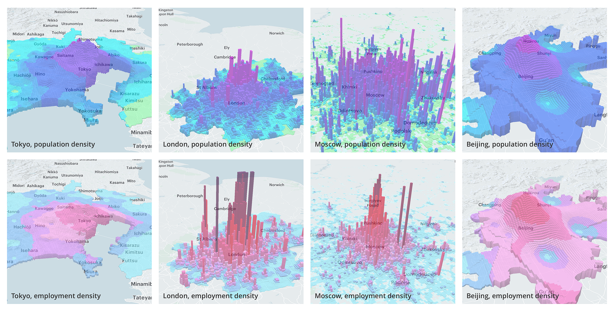
Looking at where people live and work reveals just how differently major cities are shaped. Tokyo spreads its population across an enormous urban area, while Moscow is much more concentrated around its centre, with jobs particularly focused in the capital itself. London tells a different story again: it has an exceptionally strong central business core, but also a number of significant centres beyond it. Put side by side, these patterns provide a fascinating glimpse into the very different ways that cities grow, connect and function.
Extending the study
Our explorer builds on Urbica’s central idea: cities make more sense when population is viewed as a continuous landscape rather than something confined by administrative boundaries. From there, we extend the concept in three directions — allowing you to move seamlessly from neighbourhoods to entire regions, travel back through more than three decades of change, and explore cities anywhere in the world on the same basis.
The first extension is scale. Instead of using a fixed square grid, we use H3, Uber’s hierarchical geospatial index, which divides the world into a nested network of mostly hexagonal cells. In practical terms, this means the explorer can show fine detail when you are looking closely at a city, then smoothly simplify the picture as you zoom out. The same underlying structure works whether you are exploring a neighbourhood, a metropolitan area or an entire region.
The second extension is time. The explorer contains an annual snapshot for every year from 1990 to 2024, allowing you to see not only how large a city has become, but how its shape has changed along the way. New centres emerge, existing ones intensify and urban areas stretch steadily outwards. Prosperity changes too, giving another dimension to the story of how cities have evolved over the past 34 years.
The third extension is global coverage. Every city is presented using the same population, prosperity and visual framework, which makes comparisons remarkably easy. Melbourne can be placed alongside Mumbai, Hobart alongside Dhaka, or Sydney alongside Lagos. The cities may be vastly different in scale and character, but the explorer gives us a common lens through which to understand them.
Reading the population landscape
The explorer represents each city as a landscape of hexagonal cells, with height showing population concentration. Taller areas are simply places where more people live — they do not represent buildings or the physical skyline.
As you zoom in, the hexagons reveal increasingly fine local detail; zoom out and they combine into a broader picture of the city. Most importantly, every city uses the same scale. A tall peak in Cairo therefore genuinely represents a greater concentration of people than a smaller peak in Melbourne, making comparisons between cities both intuitive and meaningful.
Deriving population and prosperity
In this explorer, prosperity means estimated real economic output per resident, adjusted so that purchasing power can be compared between countries. Operationally, the measure is real GDP per person at purchasing-power parity, expressed in constant 2021 international dollars. It is a measure of material economic scale, not household wealth, disposable income or wellbeing.
No single source observes that measure alongside population at neighbourhood scale for every city and every year. We therefore combine datasets at the scales they can support rather than presenting a modelled H3 value as a direct observation.
Deriving population and prosperity
To explore how cities have changed, we need to understand two things: where people live, and how prosperous those places are. There is no single dataset that tells us both of those things, at neighbourhood scale, for every city in the world and across more than three decades.
So rather than pretending such a dataset exists, we combine several sources — using each for what it does best.
| Source | Temporal cadence | Spatial granularity | Use in the lab |
|---|---|---|---|
| GHS-POP R2023AEuropean Commission Joint Research Centre | Five-year source epochs; the lab uses 1990, 2000, 2010, 2020 and 2025 | 100 m raster, aggregated to H3 resolution 8 | Sets population at the five anchor years. Each H3 cell is interpolated between anchors to create the annual population surface. |
| GDP per person at PPP, version 4Kummu, Kosonen and Masoumzadeh Sayyar | Annual values, 1990–2024; source releases are versioned, not guaranteed annually | Second administrative level (ADM2) | Sets the absolute regional prosperity level in constant 2021 international dollars. It is not a city or neighbourhood series. |
| Kontur Population2023 reference surface | One current reference snapshot | H3 resolution 8, about 0.74 km² per cell on average | Provides the fine H3 reference grid and population weights used to normalise the prosperity allocation inside each ADM2 region. |
| Relative-prosperity inputsABS SEIFA, US ACS, English IMD, Eurostat and Meta RWI | Latest source snapshot; generally 2019–2022, not an annual history | SA1, census tract, LSOA, NUTS3 or approximately 2.4 km RWI cells | Ranks areas within each country and allocates regional PPP across H3 cells. These inputs never set the absolute prosperity level. |
| World Bank fallbackGNI per person at PPP, or GDP per person where GNI is unavailable | Annual national series; latest available value when the seed is built | Country, varied locally with population-density rank | Fills gaps only when a finer source is absent. It is deliberately lower priority and is replaced when a better local source is available. |
Following where people live
Our population story begins with the European Commission’s GHS-POP, which maps where people live across the world at very fine resolution.
It provides global population snapshots for a series of years between 1990 and 2025. We translate those snapshots onto our hexagonal grid and fill in the years between them, giving the explorer an annual view from 1990 to 2024.
This allows cities to do more than simply get bigger. Their centres can intensify, suburbs can spread outwards and entirely new concentrations of population can emerge. The years between the original snapshots are estimates rather than separate censuses, so the timeline is best thought of as a smooth reconstruction of how each city has evolved.
Making prosperity comparable around the world
Prosperity is a little more complicated because money does not mean the same thing everywhere.
A dollar converted at a foreign-exchange rate can buy very different amounts in Sydney, Mumbai or Lagos. Economists deal with this using purchasing-power parity, or PPP, which adjusts for differences in local prices and gives us a more meaningful basis for comparing economies.
For the explorer, prosperity therefore means economic output per person, adjusted for purchasing power. It is expressed in constant 2021 international dollars so that we can compare both different countries and different years on the same basis.
It is worth stressing what this does not mean. It is not household income, personal wealth or a measure of happiness or quality of life. It is simply a consistent way of comparing the broad economic prosperity of different places.
From regions to cities
The global prosperity data from Kummu, Kosonen and Masoumzadeh Sayyar gives us an annual economic picture from 1990 to 2024, but at a regional rather than neighbourhood level.
Simply painting the same prosperity value across an entire region would make cities look unnaturally uniform. Anyone familiar with a major city knows that economic conditions can change dramatically over relatively short distances.
We therefore use finer local indicators to help distribute that regional prosperity more realistically. Depending on the country, these include sources such as Australian SEIFA data, US Census information, European regional statistics and Meta’s Relative Wealth Index.
The important point is that these local sources shape the distribution rather than determine the total. More prosperous-looking areas can rise above the regional average and less prosperous areas can fall below it, but everything is balanced back to the known regional figure. We are redistributing the economic picture at finer scale, not inventing additional prosperity.
Understanding the colours
Before exploring what the patterns mean, it helps to understand how the colours themselves work.
A choropleth map is simply a map where geographic areas are coloured according to a value. You may have seen countries shaded by population, electorates by voting results or regions by income. In our explorer, those geographic areas are the hexagons that make up the urban landscape.
Although the hexagons also rise into columns, colour and height have distinct jobs. Height shows population concentration, while colour allows us to describe the character of each part of the city.
The easiest way to understand the colour system is to start with one measure at a time.
Population density
First, imagine that colour represents only population density.
Less densely populated areas begin in cyan, with increasingly dense areas moving towards magenta. Each hexagon is therefore answering one simple question: how concentrated is the population here?
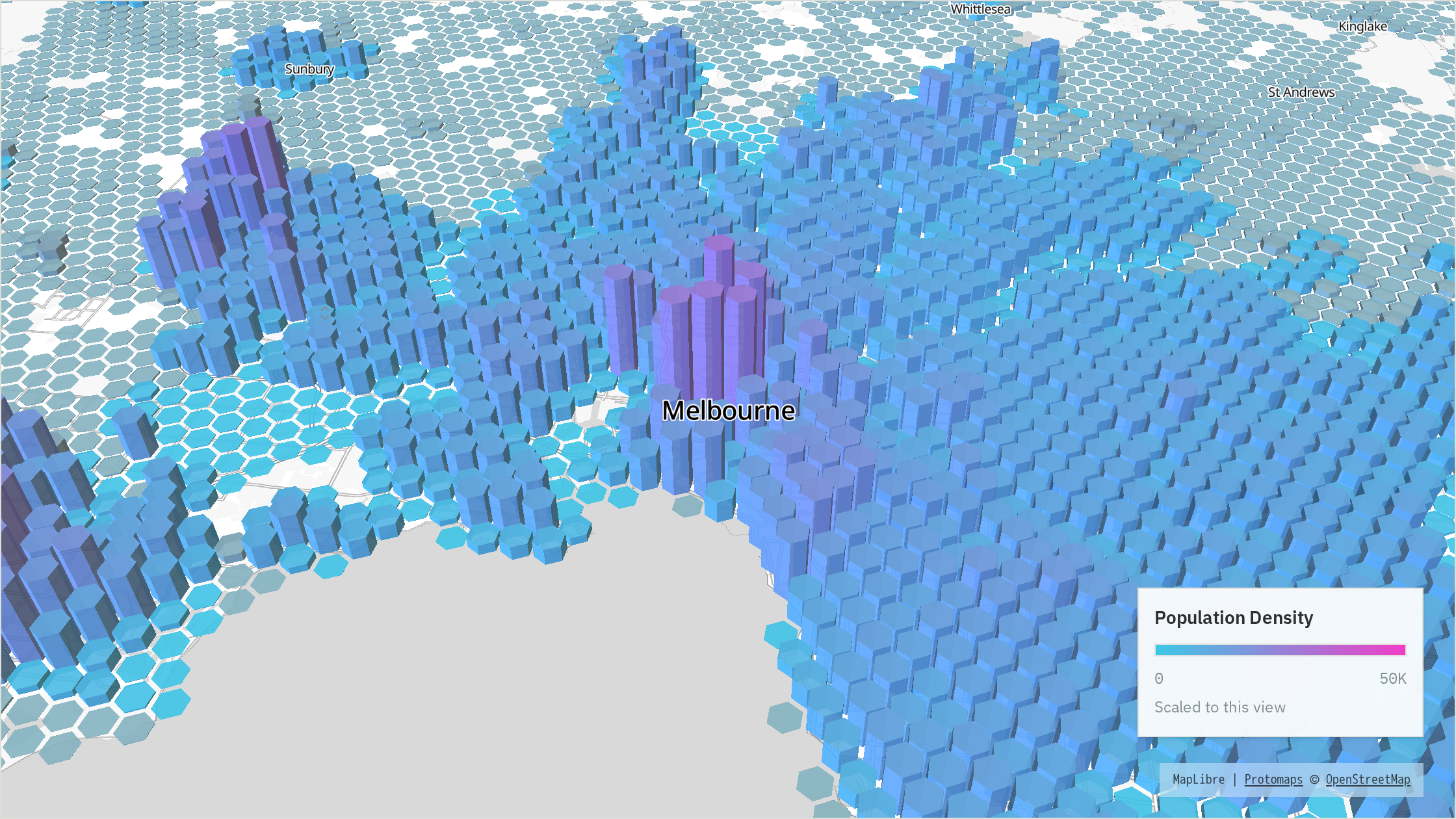
The height of the landscape reinforces the same idea, making the major concentrations of people particularly easy to see.
Population density, Melbourne The colour scale moves from cyan towards magenta as population density increases. Height also represents population concentration.
Prosperity
Now we can look at exactly the same city through a different lens.
This time, colour represents prosperity, moving from cyan towards yellow as estimated prosperity increases. Population continues to determine the height of the landscape, but it no longer determines its colour.
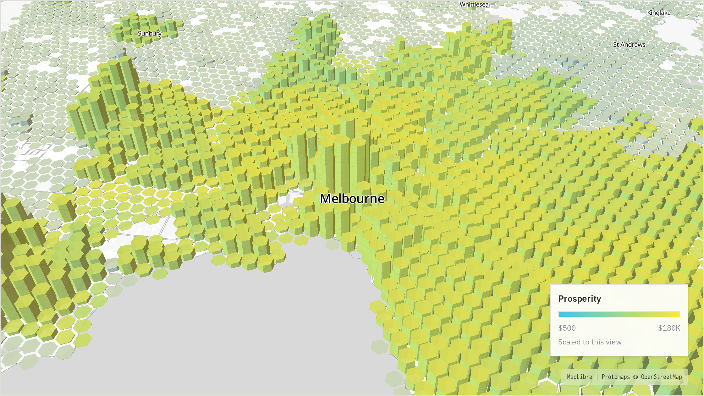
Putting these first two views side by side makes the distinction clear. One shows us where people are concentrated; the other shows us how prosperity varies across the city.
Prosperity, Melbourne The colour scale moves from cyan towards yellow as estimated prosperity increases. Height continues to show population concentration.
Bringing the two together
The final step is to combine the two.
We divide population density into three broad levels and prosperity into three broad levels. Crossing those together gives us nine possible combinations, each represented by a different colour.
The diagram makes the idea fairly intuitive:
population density + prosperity = map colour
Read the colour matrix like a small table. Moving upwards means increasing population density. Moving from left to right means increasing prosperity.
The lower-left corner therefore represents places that are both less densely populated and relatively less prosperous. Move upwards and population density increases. Move to the right and prosperity increases. The upper-right corner represents places where both are high.
The colours between those extremes represent the different combinations along the way.
A bivariate view of the city
Combining two measures on a single map is known as a bivariate choropleth. “Bivariate” simply means that we are looking at two variables at the same time.
people
prosperous
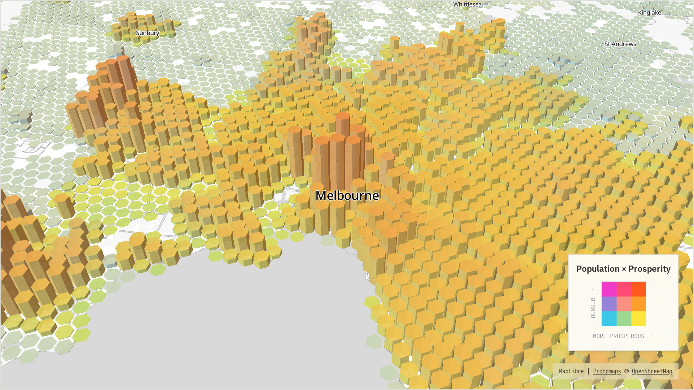
This is where the map becomes particularly interesting. Areas with similar population densities can have very different levels of prosperity, while equally prosperous areas can have completely different urban forms.
A dense but relatively less prosperous district takes on a different colour from a prosperous low-density suburb. Places where both density and prosperity are high appear differently again.
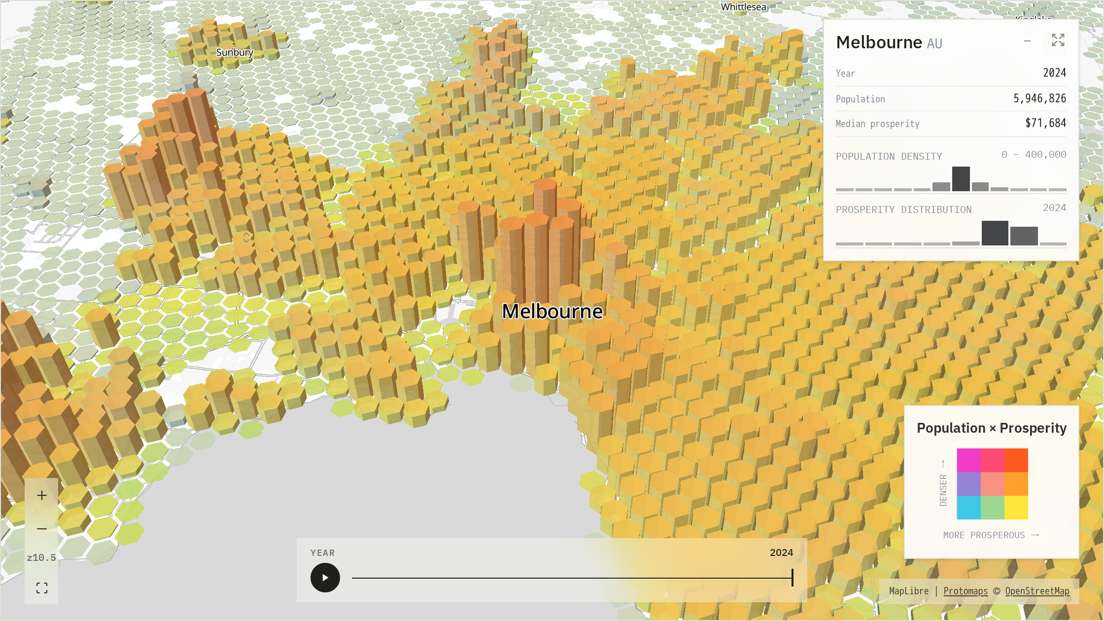
Population density × prosperity, Melbourne Each colour represents a combination of population density and prosperity, while height continues to show population concentration.
The goal is not to turn every colour into an exact number. The colour system is designed to make spatial patterns and contrasts easy to recognise — patterns that can be surprisingly difficult to see when population and prosperity are considered separately.
What the colours are really telling us
Once the two colour scales are combined, the map becomes much more than a picture of where people live. It begins to reveal the different character of places within a city — dense but relatively less prosperous districts, affluent low-density areas, and locations where both population concentration and prosperity are high.
These patterns are most useful when read at the scale of a city or metropolitan area. The explorer is designed to show broad differences in urban structure and how those differences change over time, rather than assign an exact economic value to an individual neighbourhood or household.
Some parts of the world have much richer local data than others, and historical neighbourhood-level prosperity is not independently observed for every year. The colours should therefore be read as a consistent comparative signal rather than a precise local measurement.
Think of the map as a common lens through which cities can be compared. Melbourne and Mumbai, Sydney and Lagos, or London and Cairo can all be viewed using the same visual language — making differences in their shape, density and prosperity much easier to see.
Patterns across cities
Once you begin moving between cities, some strikingly different urban patterns start to emerge.
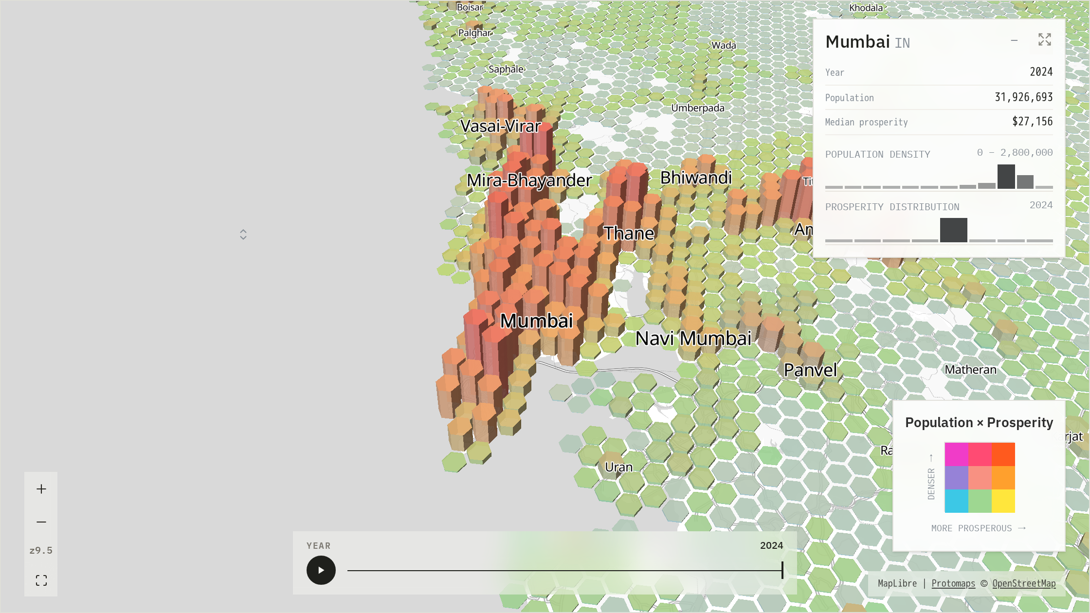
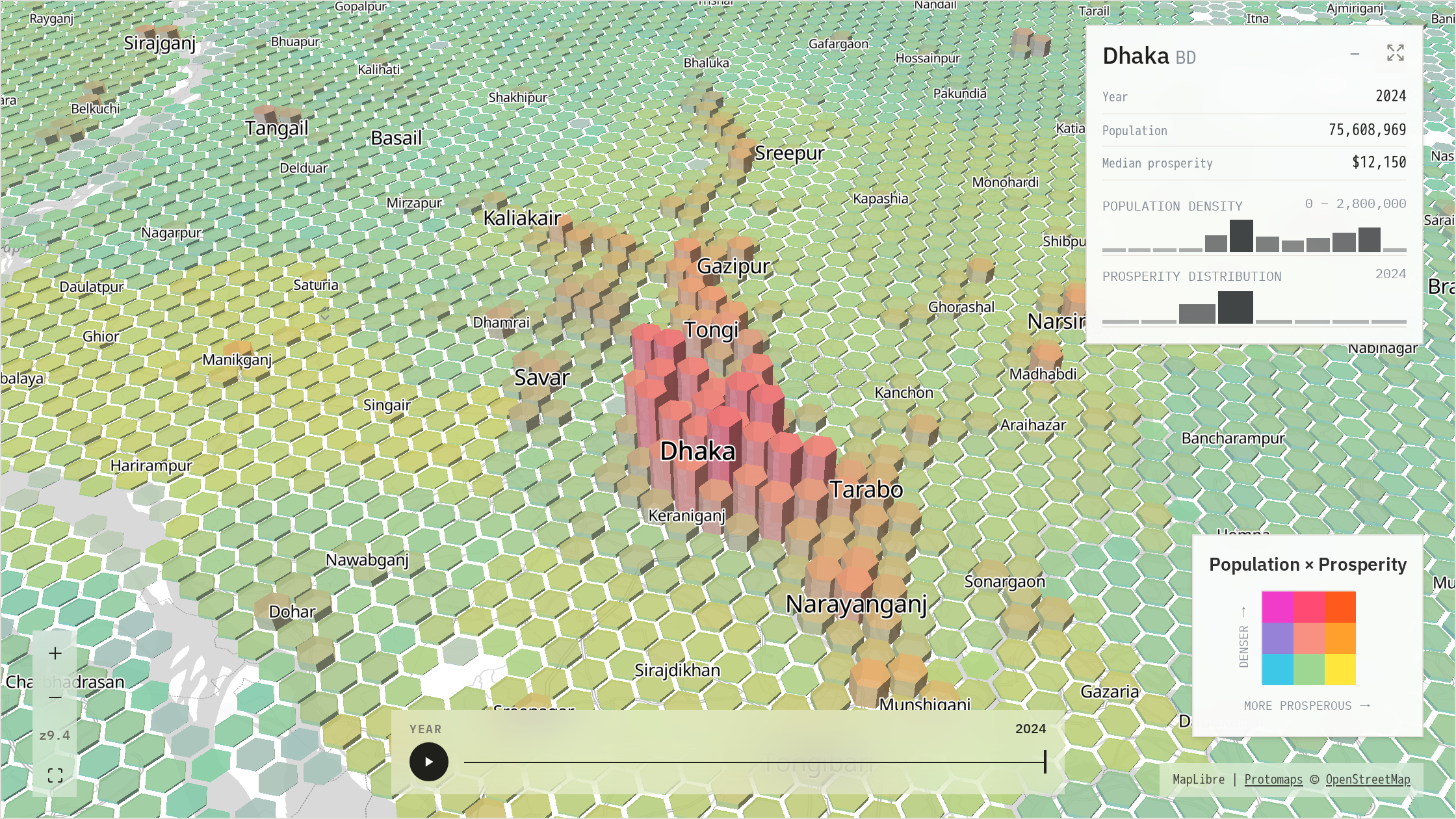
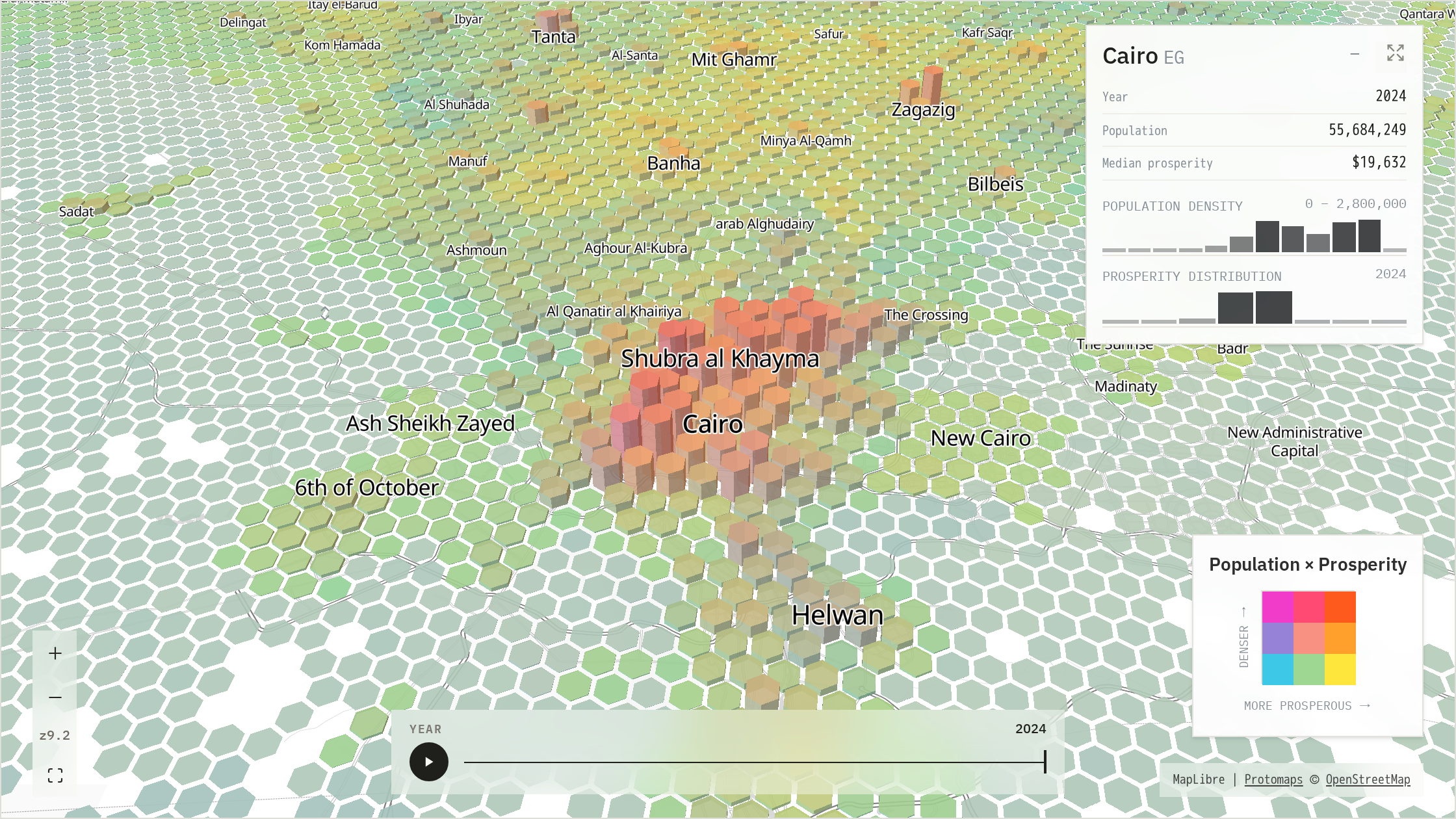
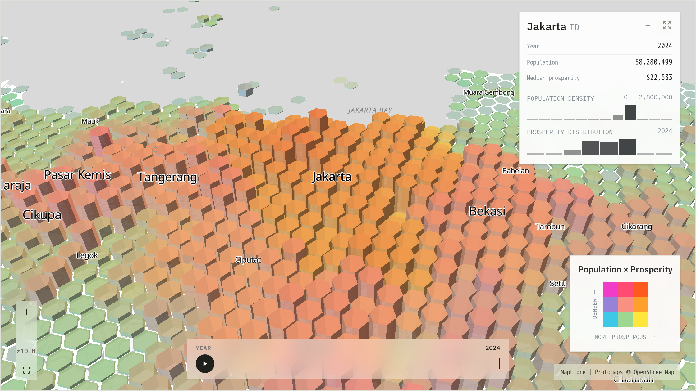
Big cities can be big in very different ways. Melbourne spreads across a remarkably broad area, with a recognisable centre but relatively modest peaks. Jakarta is vastly larger and more continuous, while Cairo rises much more sharply from its surroundings. Mumbai and Dhaka combine both enormous scale and intense population concentration. There is no single shape of a megacity: some grow outwards, some grow upwards in density, and some do both.
Geography leaves its fingerprints everywhere. Coastlines, rivers, harbours and other physical barriers remain clearly visible in the population landscape. Mumbai follows the shape of its peninsula, Cairo stretches along the Nile, Sydney wraps itself around its harbour, while waterways break up the urban fabric of Manila and Lagos. What appear at first to be gaps in the city often reveal the geography that shaped its growth.
Not every city has one dominant centre. Some cities form around a strong central core, while others develop as a collection of interconnected centres. Jakarta spreads across a broad field of activity, Delhi maintains remarkable density across a vast area, and Melbourne has substantial secondary concentrations beyond its centre. At an even larger scale, places such as the Pearl River Delta begin to look less like individual cities and more like a single connected urban system.
Prosperity adds another layer to the story. Once colour is introduced, places with similar population patterns can look surprisingly different. Dense areas are not necessarily the most prosperous, nor are affluent areas necessarily concentrated around the centre. The value of the map is in revealing these broader contrasts and prompting questions about how cities are organised — rather than treating every colour difference as a precise economic measurement or an explanation of why that pattern exists.